#003 - Modular Type Submission
Originally uploaded October 3 2022.

Mathematics - my modular typeface.
This is my submission and reflection on modular type, created using dot, line and shape.
The first part is a record of my typeface experiments. The second part includes the concept, development and delivery of the final submission.
Typeface Experiments


Above are a couple of pages from my notebook, showing notes taken during classes on 20/9 and 22/9. We were exploring experimental typefaces and also the vocabulary used to describe typography.
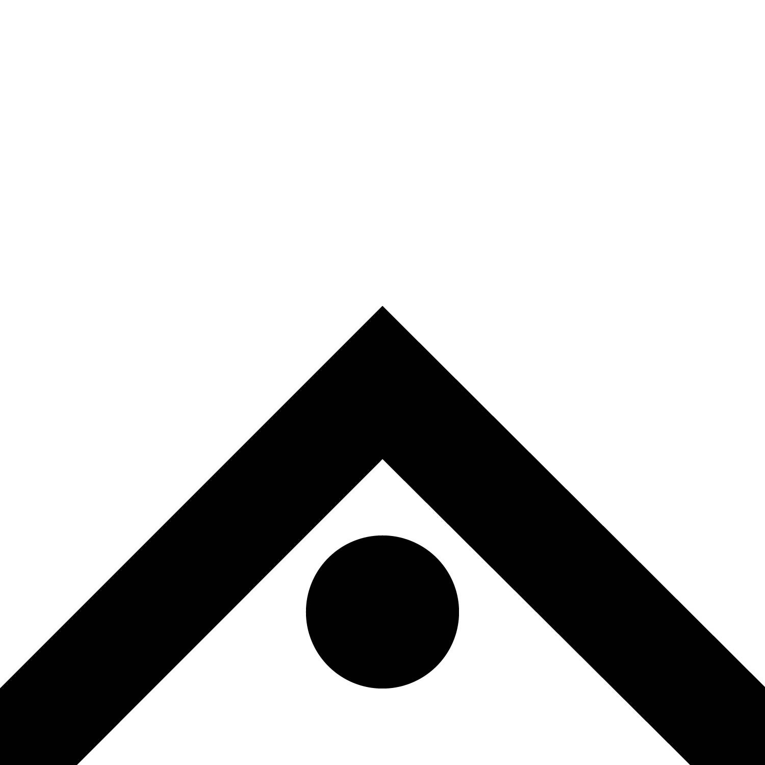
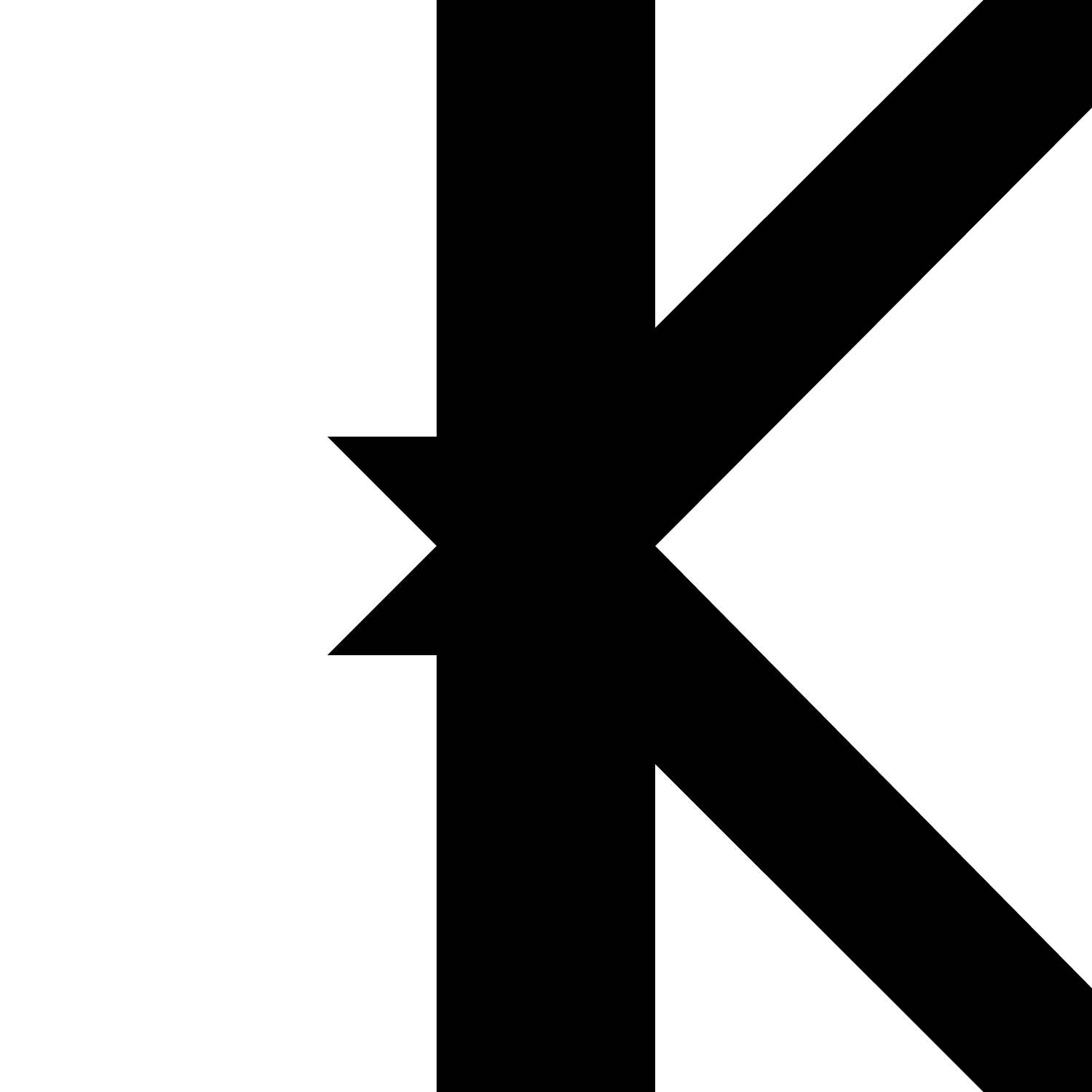
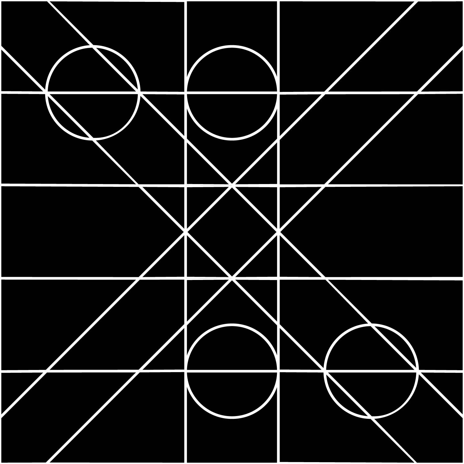
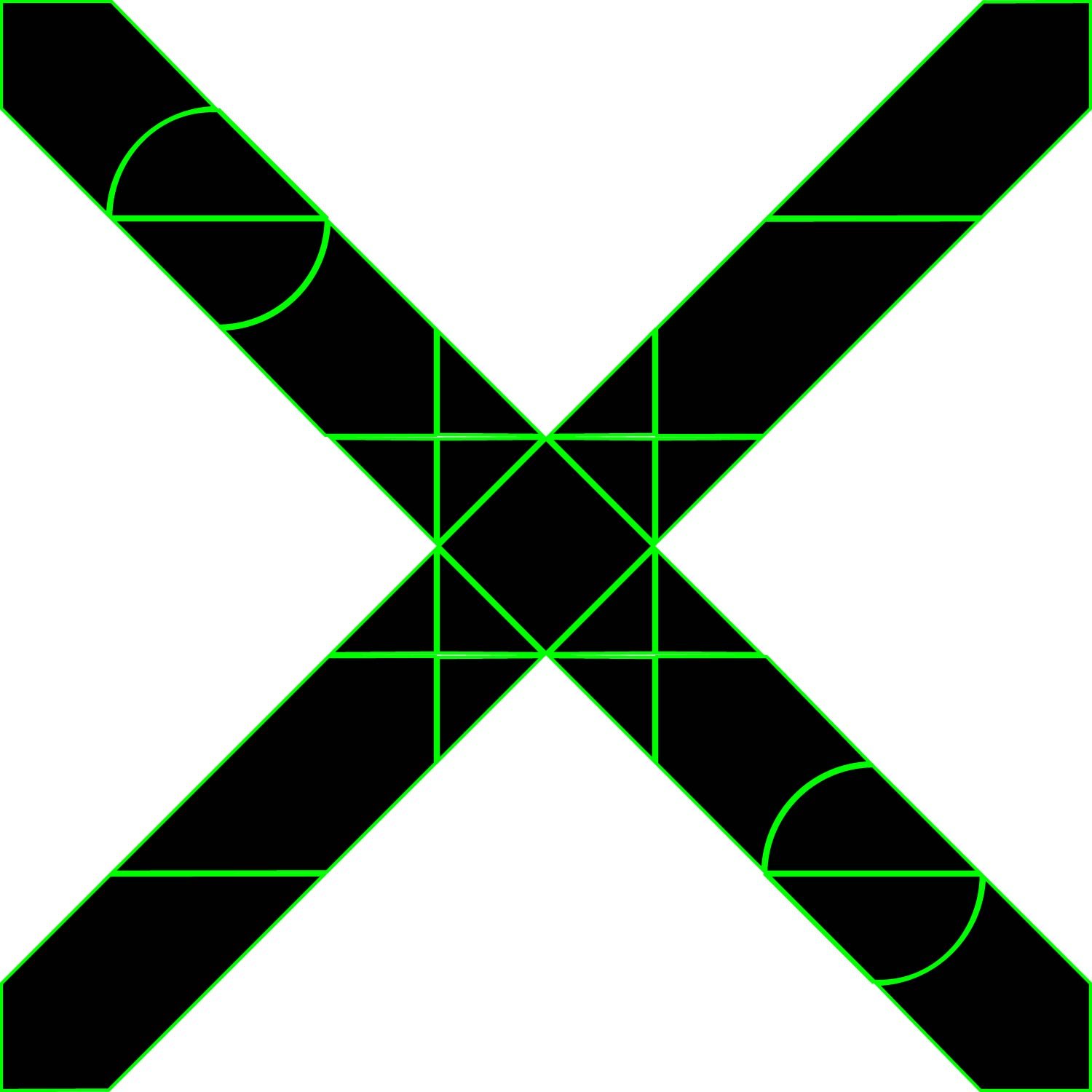
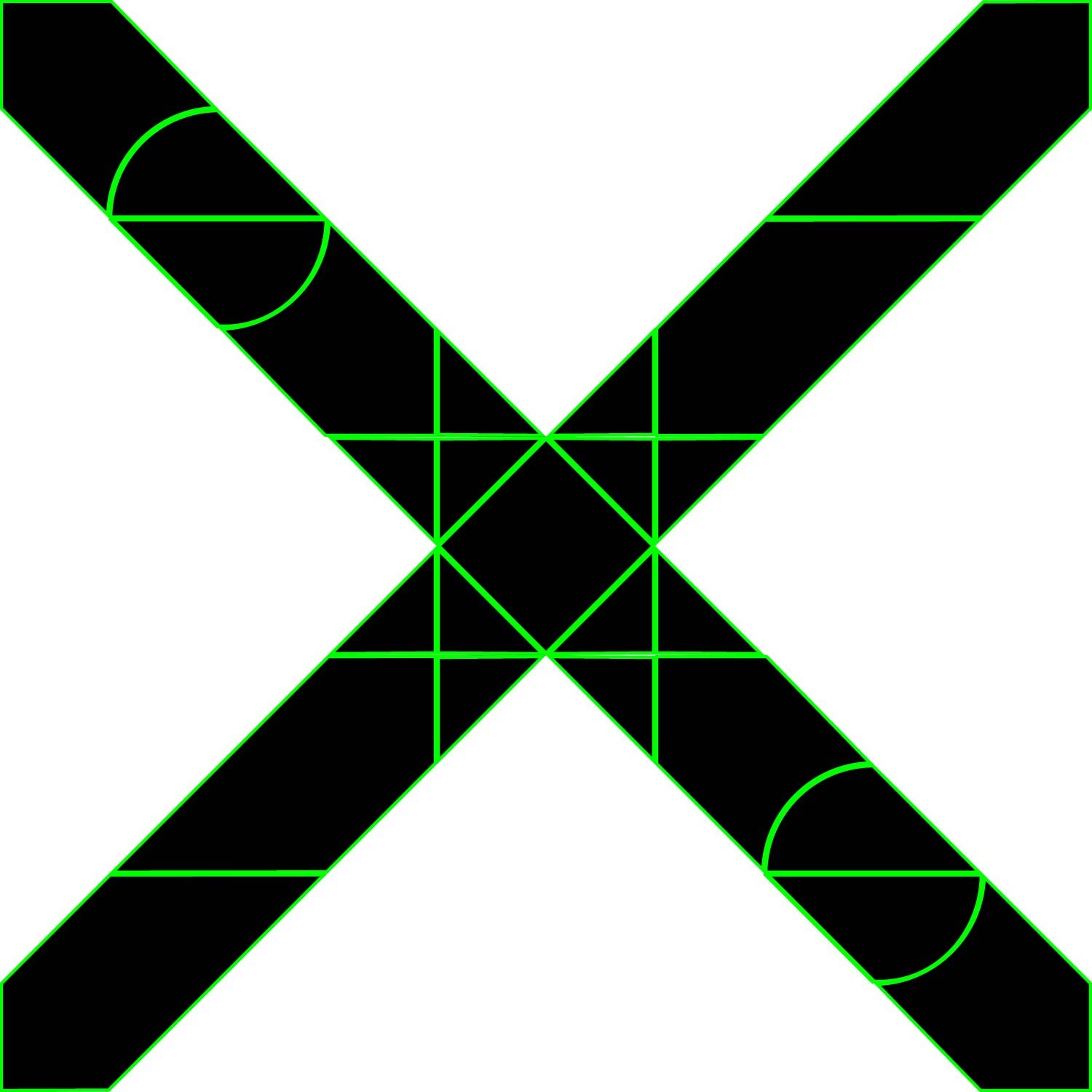
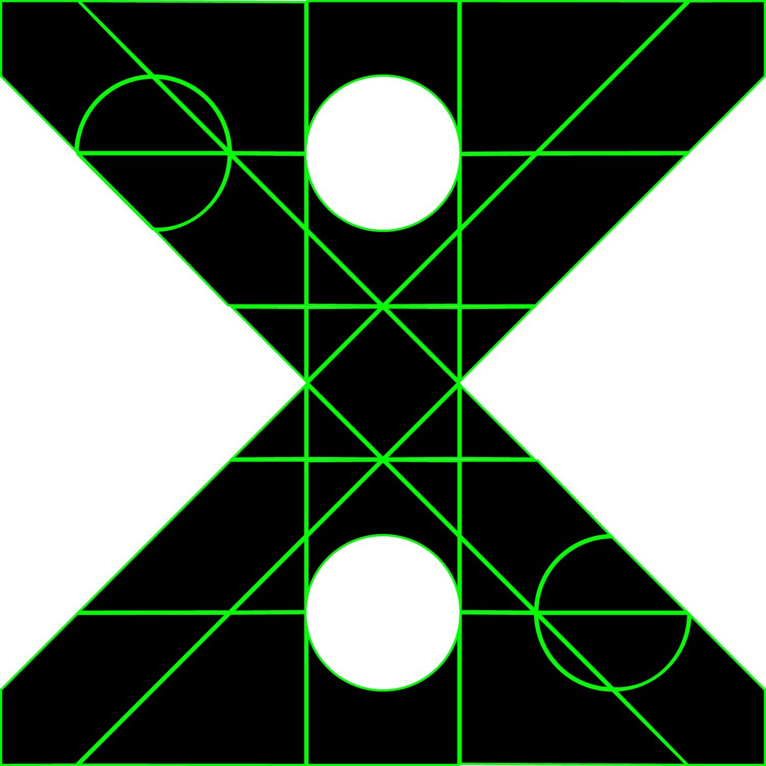
HEXAGON

One of the experimental prompts was the word HEXAGON. Based on the name of the typeface I thought the best place to start would be trying to make a hexagonal grid. My initial observations were:
All lines same weight
90 degrees, 54 degrees angle
Grid ? not sure
Appear same X-height but actually some variation
Corners cut off at 37 degree angle
Not perfect ?
Below are some screenshots as I tried to figure out the system used for the hexagonal typeface.


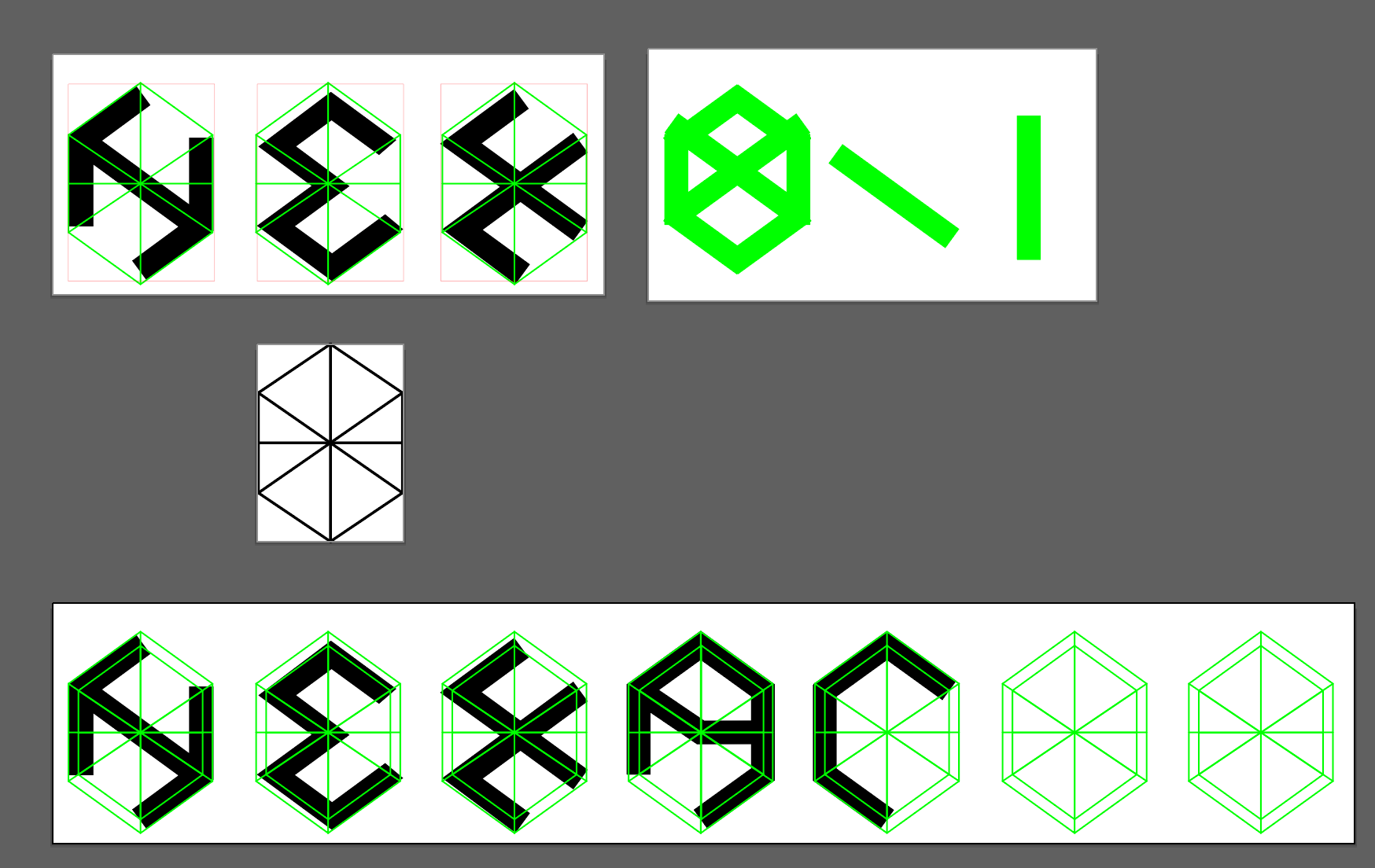

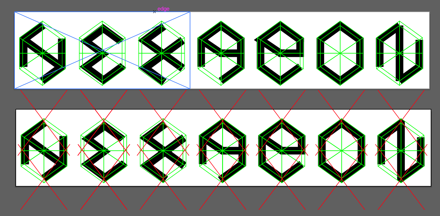

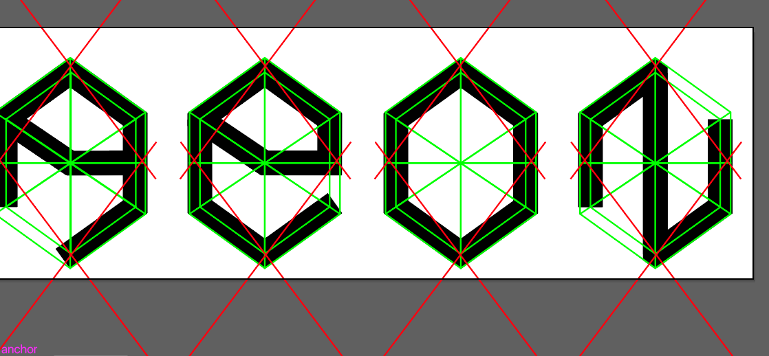

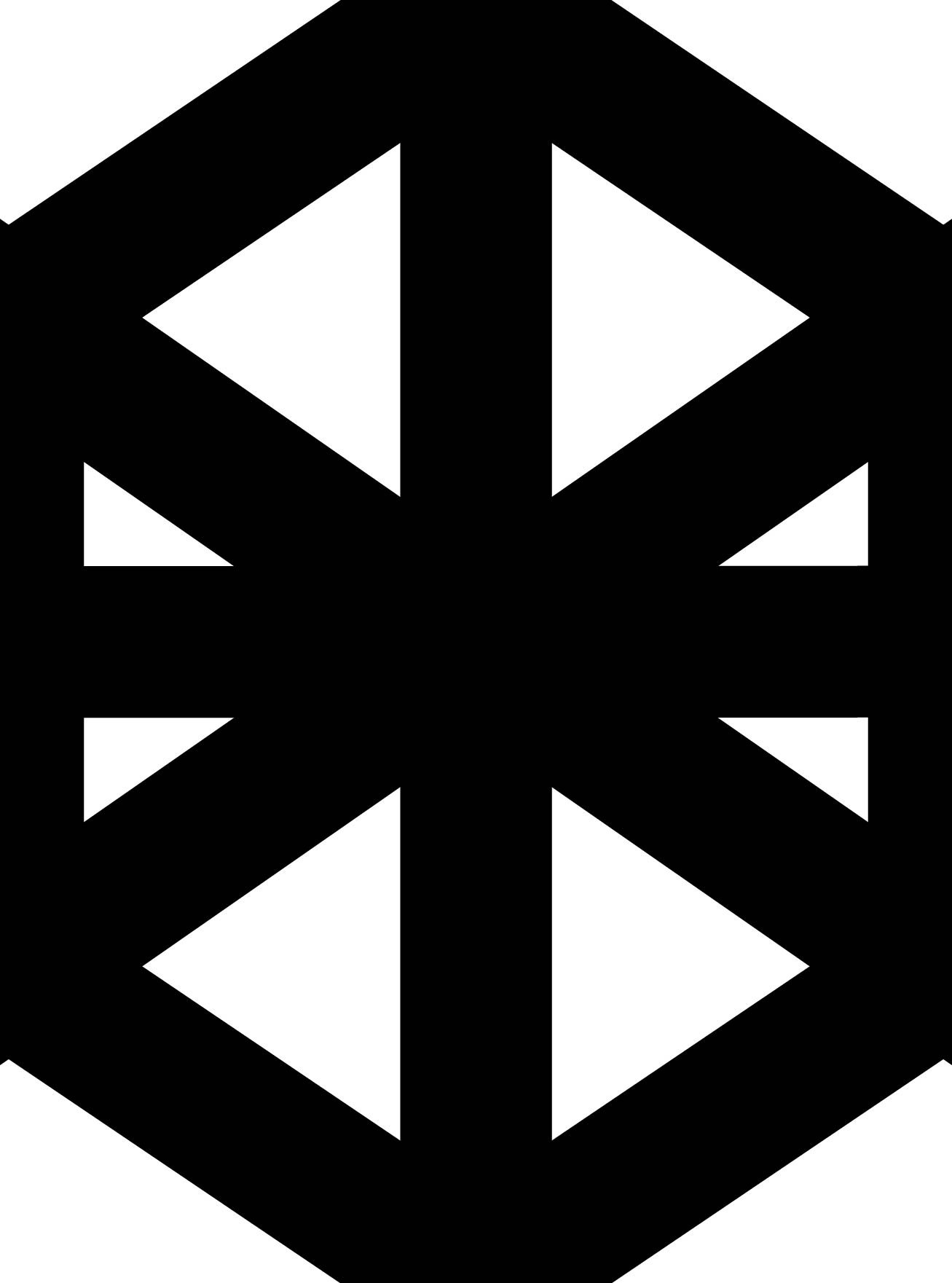
The hexagonal grid ended up being trickier than I thought it would be. It appears that this typeface doesn’t have exact measurements as it doesn’t conform perfectly to a grid. I continued using the grid all the same to create the other letters. I’m not sure if I figured out the rules for the angles used in the letterforms exactly.

The first image shows the final word made up of lines with strokes applied. The second image shows these lines expanded, then combined to create full letter forms. I’m quite happy with how it turned out! The angles used almost remind me of isometric design.
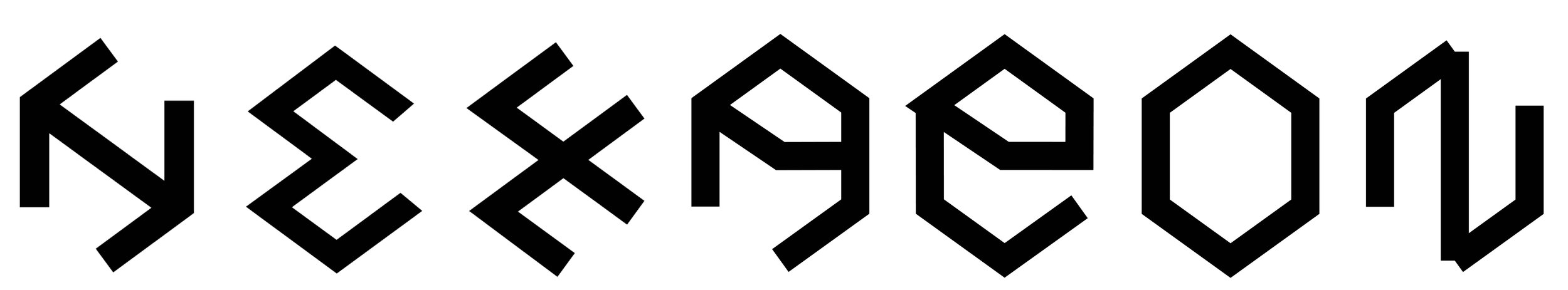
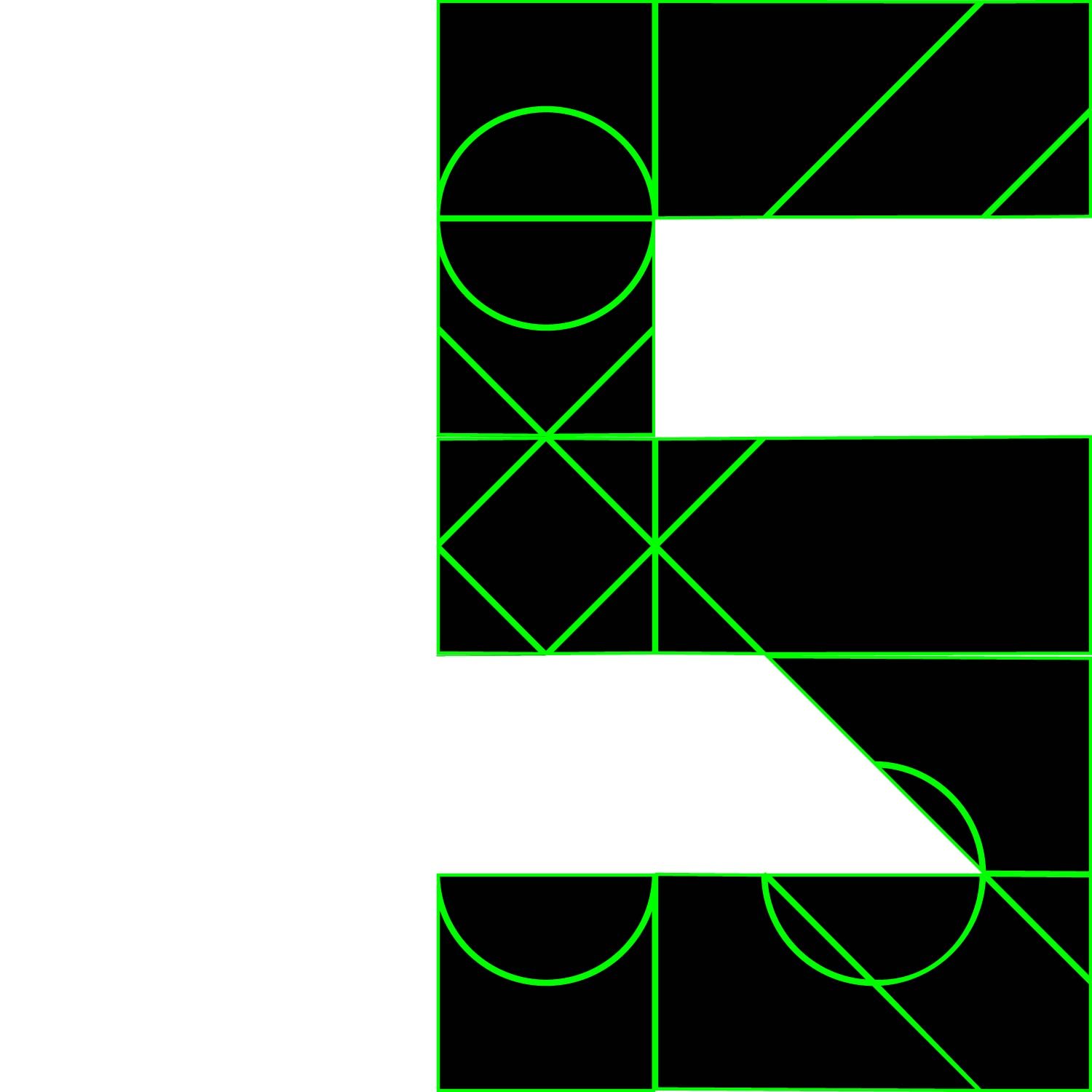
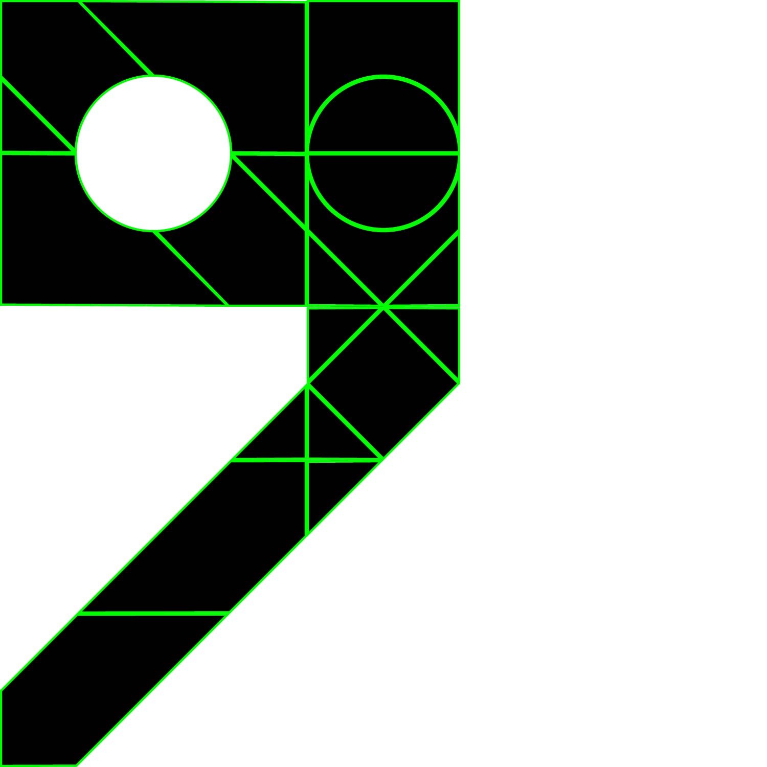
DINOSAUR

The second experimental prompt was the word DINOSAUR. This one appeared more straightforward upon first glance. My first observations were:
Made up of specific shapes
Circle, rectangle, triangle
Aligned to a perfect square or half square
Can you scale some of the elements ??
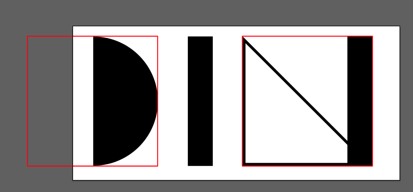
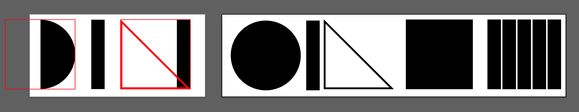


The first three parts of typeface are made up of shapes: semi-circle, rectangle, triangle (outlined). All of these fit within a 1:1 perfect square. I decided to make a palette of these shapes including variations of them, some in different sizes. Above are some screenshots of my process, below is the final result.

I’m fairly happy with the finished product. The S was quite tricky to achieve, as was the A and the R.
CELEBRITY

The final experimental prompt I explored was the word CELEBRITY. My first observations were:
combination of shapes - cut outs from a square and a circle


This typeface appeared to have 2 key elements - a circle with a triangle cut out, and a block of squares in a 3x3 grid.
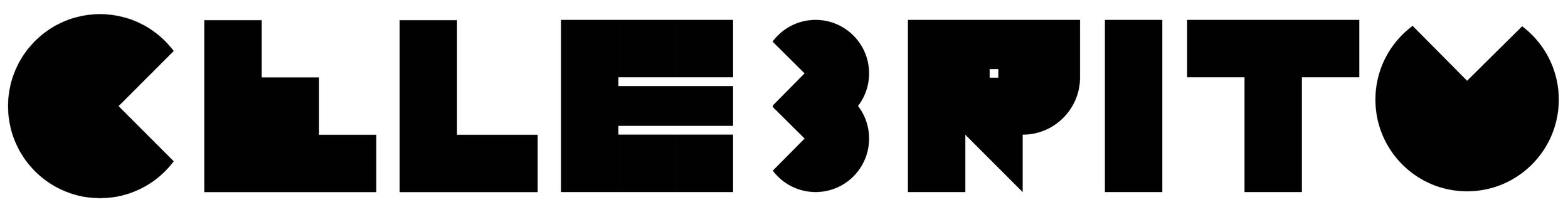

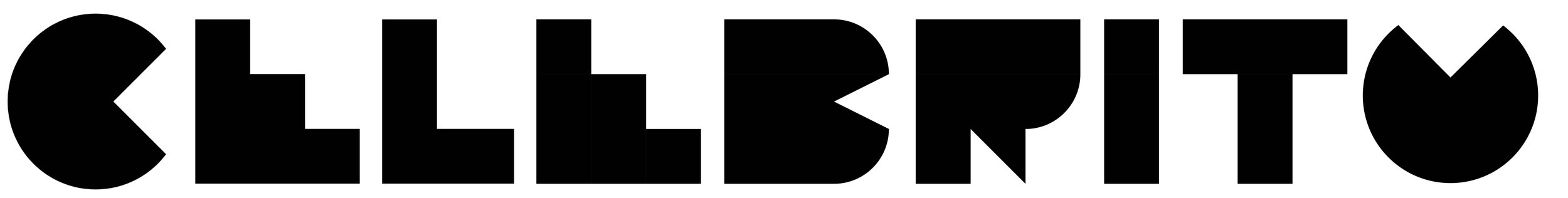
My first two attempts weren’t quite right (this was toward the end of the night!) The first one ended up breaking the rules by scaling objects to create the B. Also, I overlooked the fact that there was already an E to continue. I’m happier with the final version (above) but it’s not quite right. I’d love to have seen what the full version is!
Final Submission
Concepts


Above are a few pages from my notebook exploring some different concepts for my final submission. The first pages shows an idea I had to use concentric circles, overlayed with 4 concentric circles at the vertices of the square. This overlapping effect led me to think about what other shapes might overlap.
I explored some iconic but simple shapes made up of dots and lines: the hopscotch game, the lines on a football pitch, the shape of a velodrome from above, the eye of a crosshair.
The central page shows some further experiments with overlapping shapes, including the first attempt at what was to become my final idea: overlapping mathematical symbols to create a grid.
Development

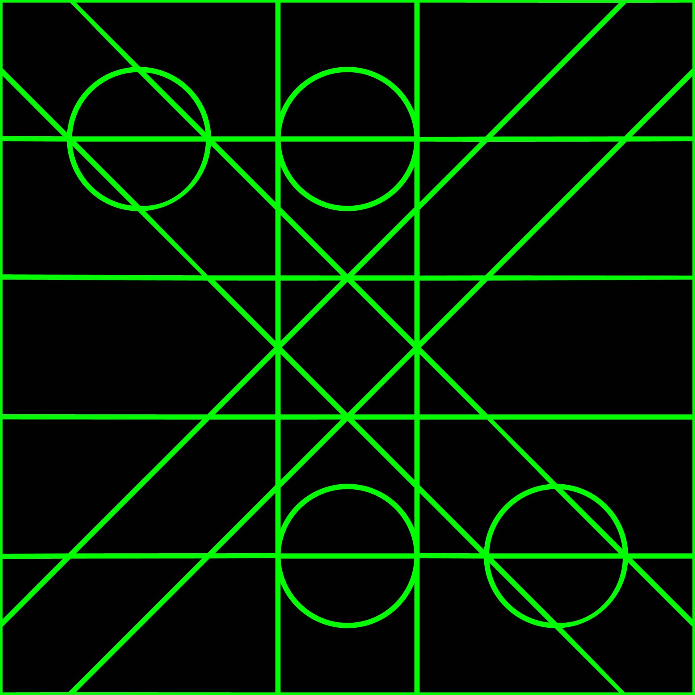
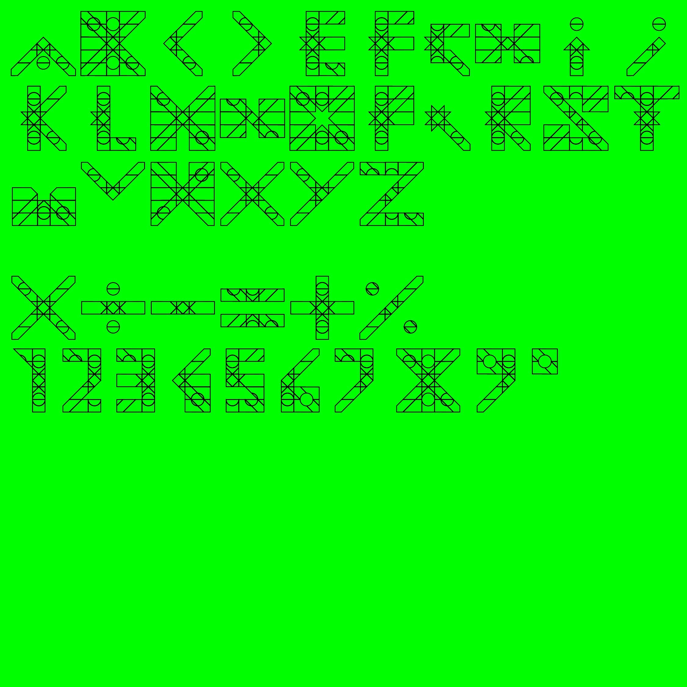
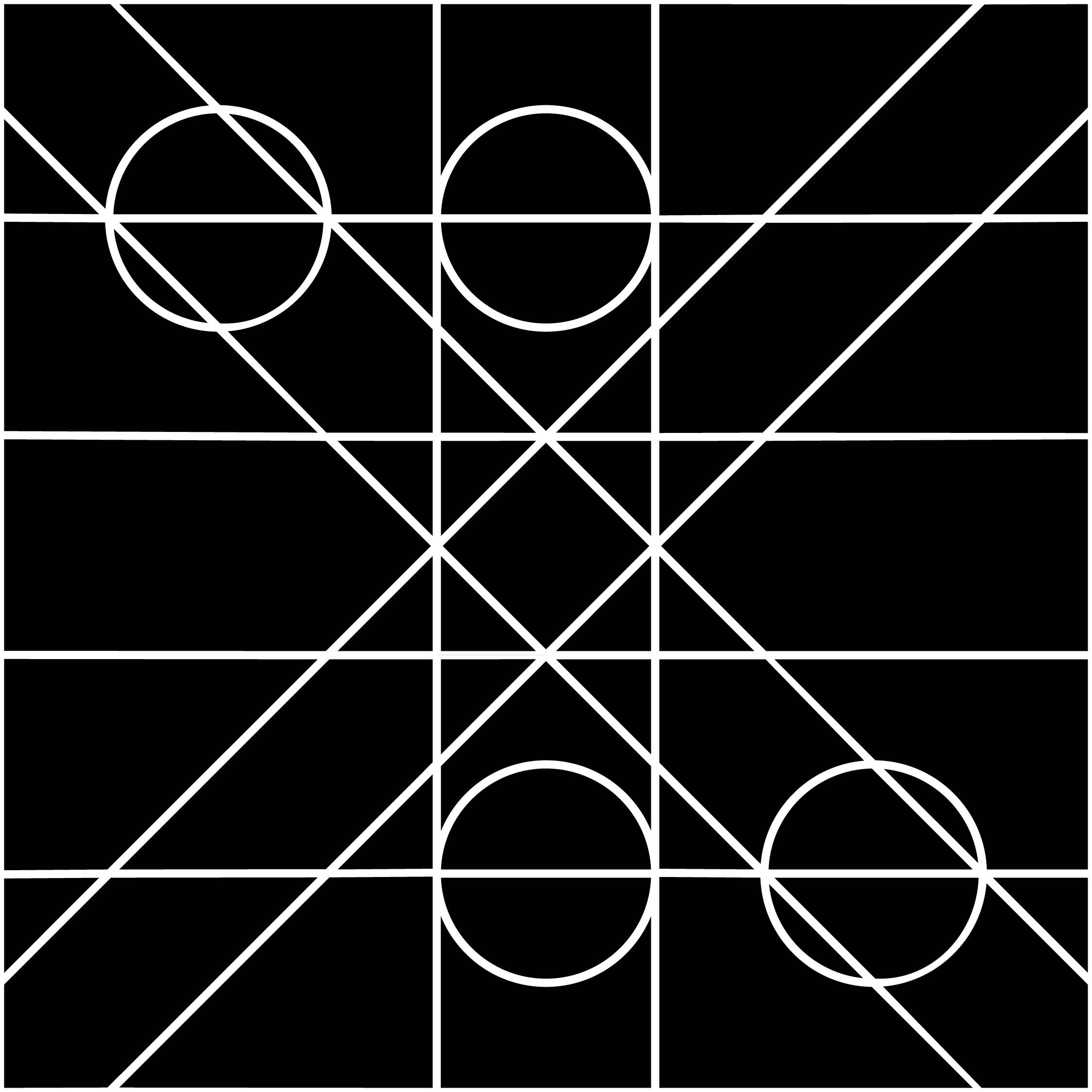
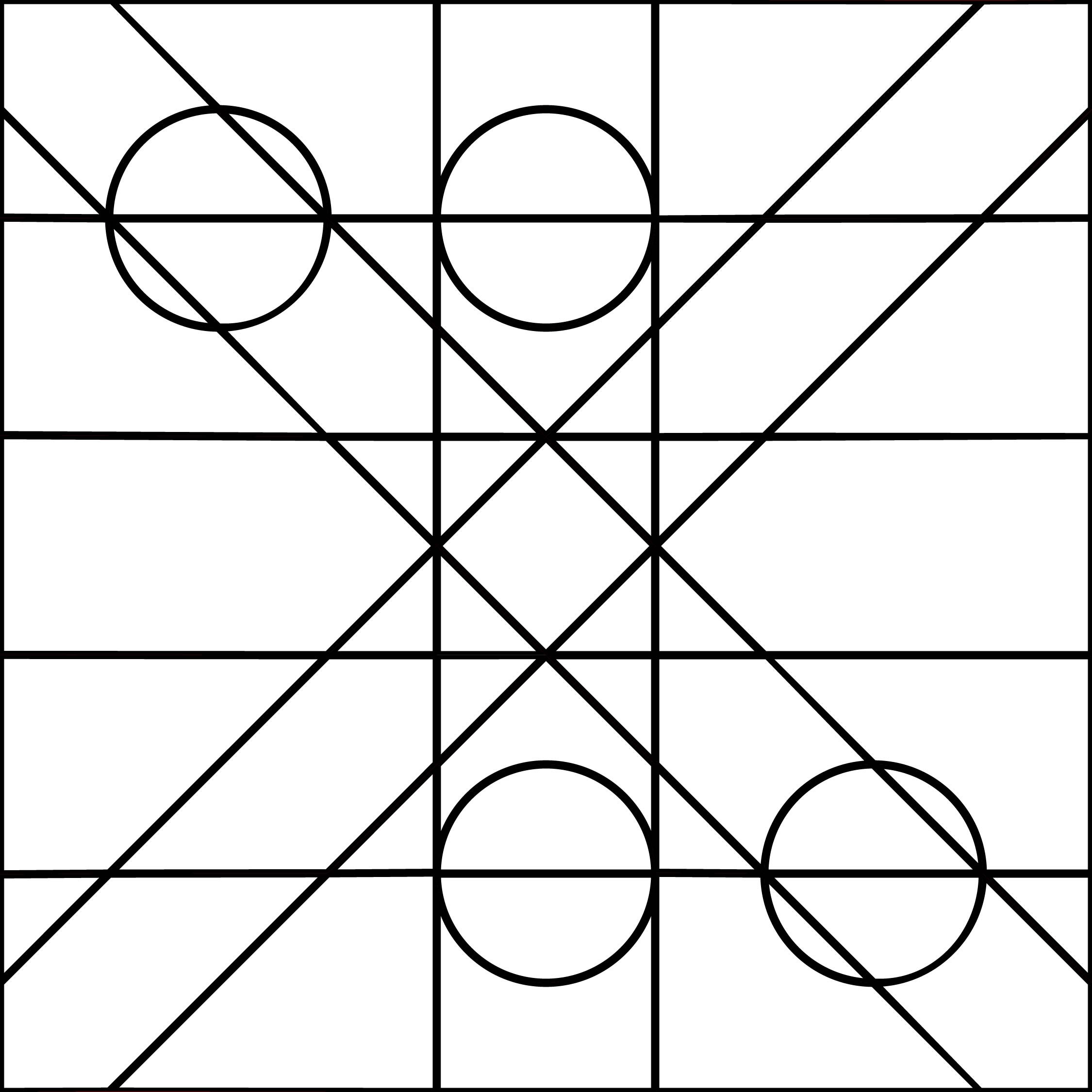
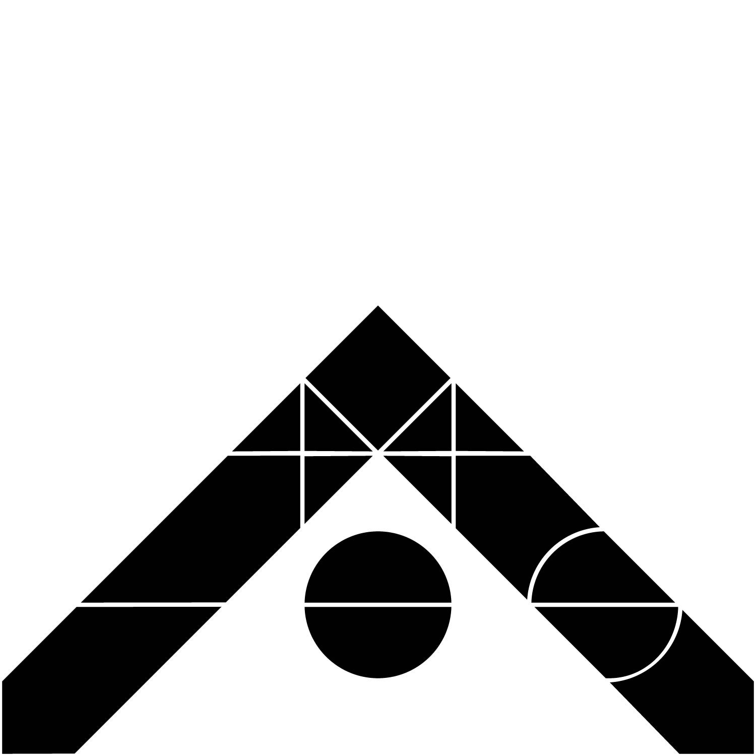
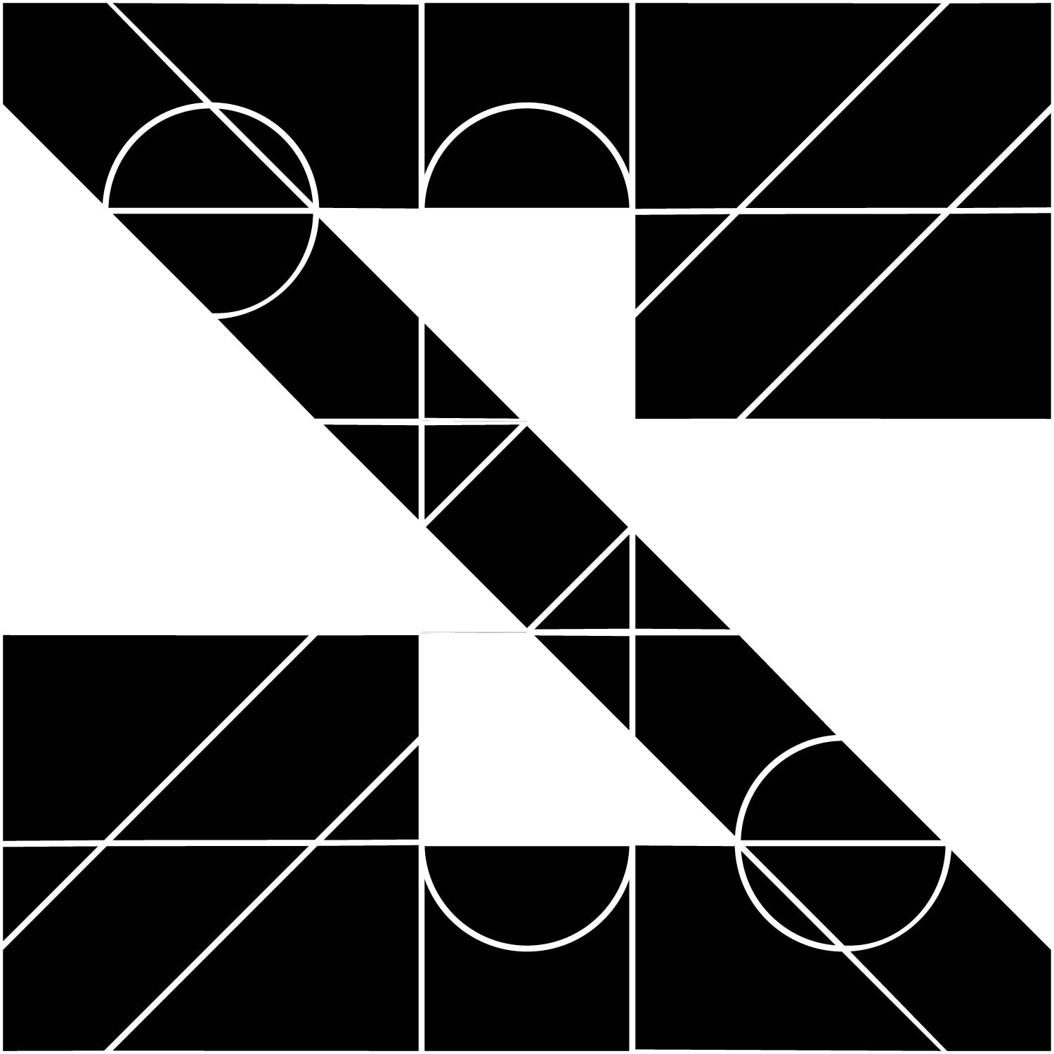
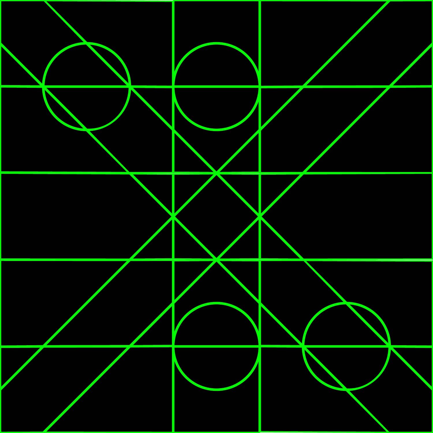
Using grid paper I decided to jump in and further explore the mathematical symbols project. The grid is plotted on a 10x10 square and features six overlapping symbols found on a common calculator: plus, multiply, divide, equals, minus and per cent. I felt that the variety these shapes would give would allow room to explore multiple letterforms and in different varieties. Rather than just doing 2 letterforms I decided to be adventurous and explore the full alphabet. It was a fun challenge to sit and figure each of them out. The measurements on this first version are a little off as I was going from a 10x10 square to a 3x3 square and not using a ruler.
Delivery
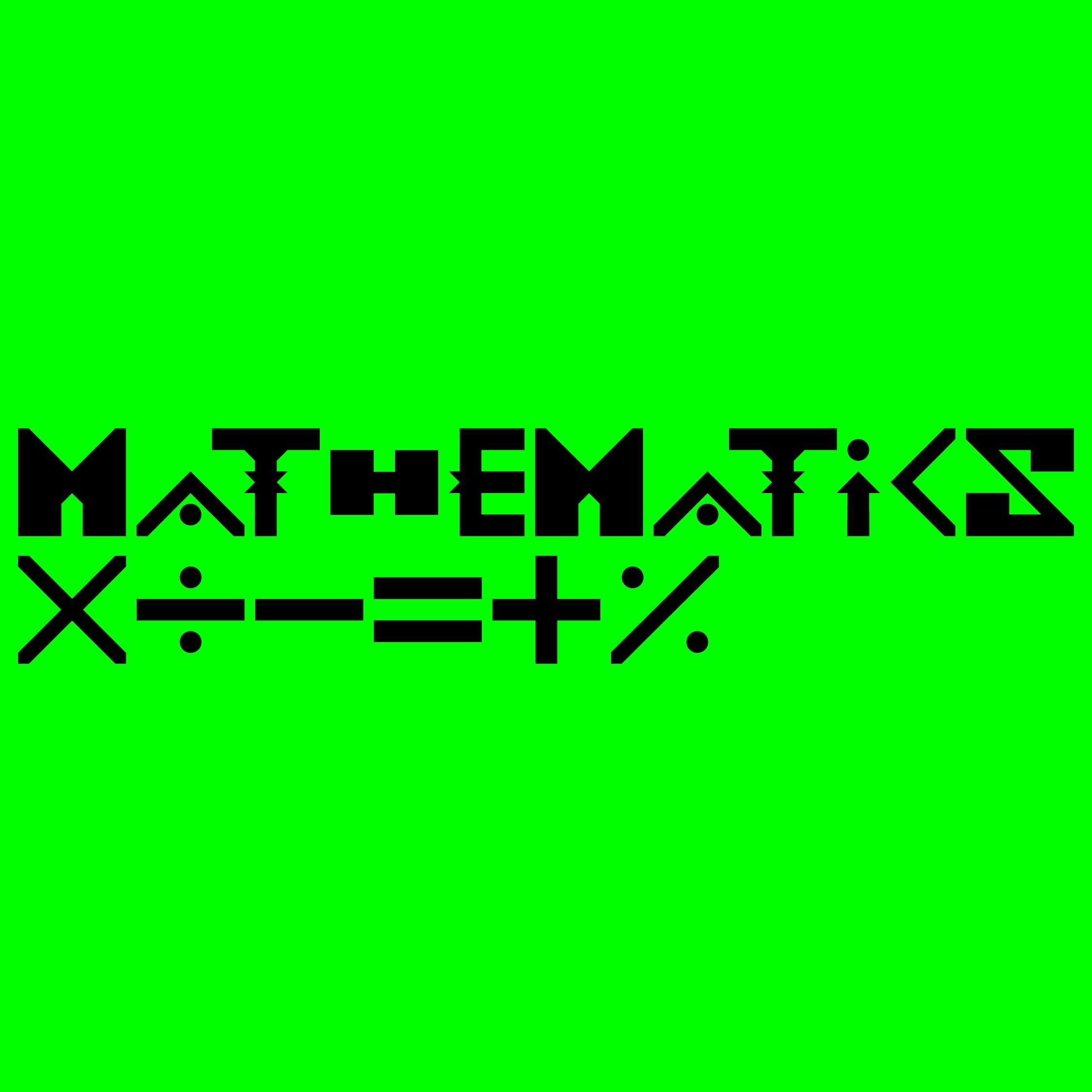
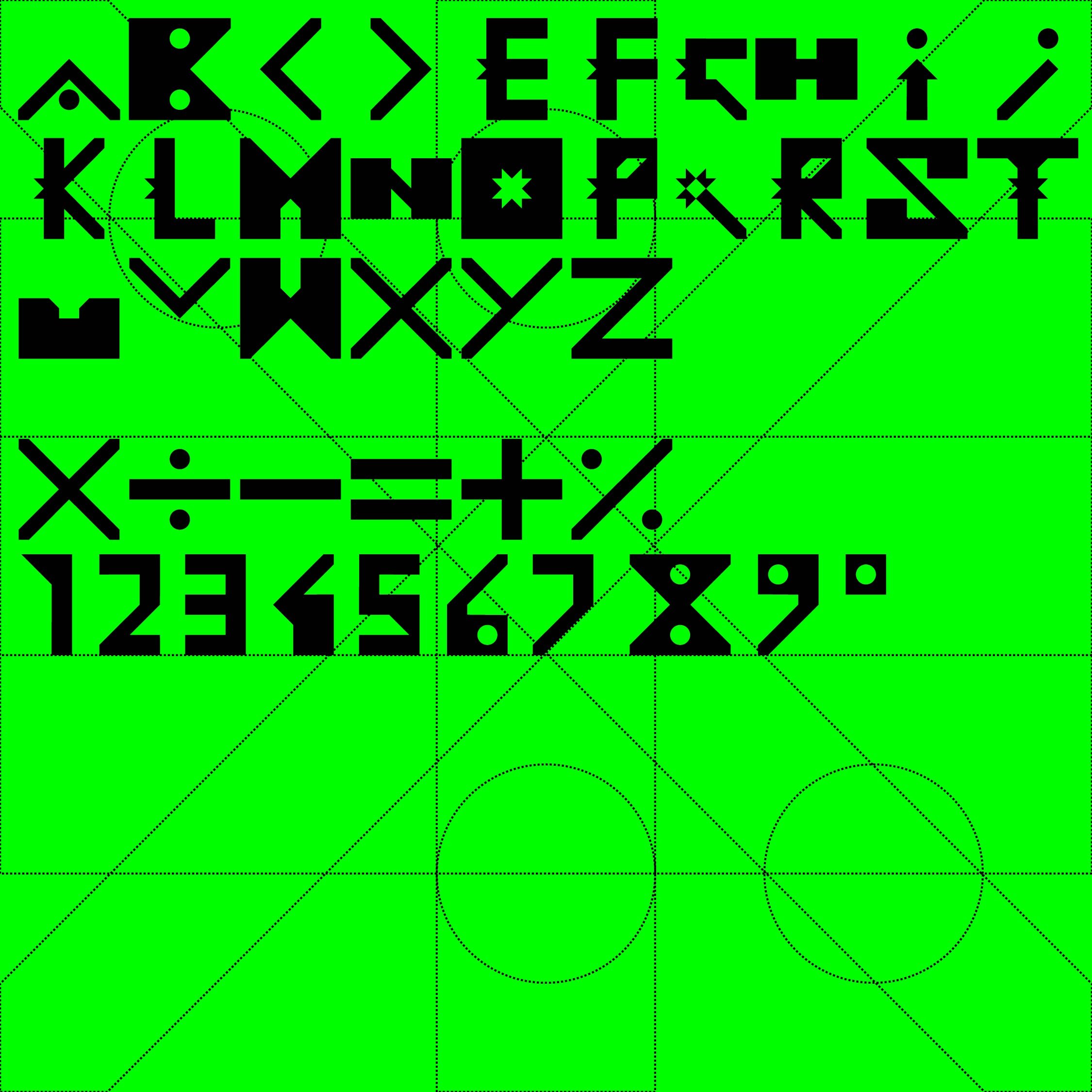
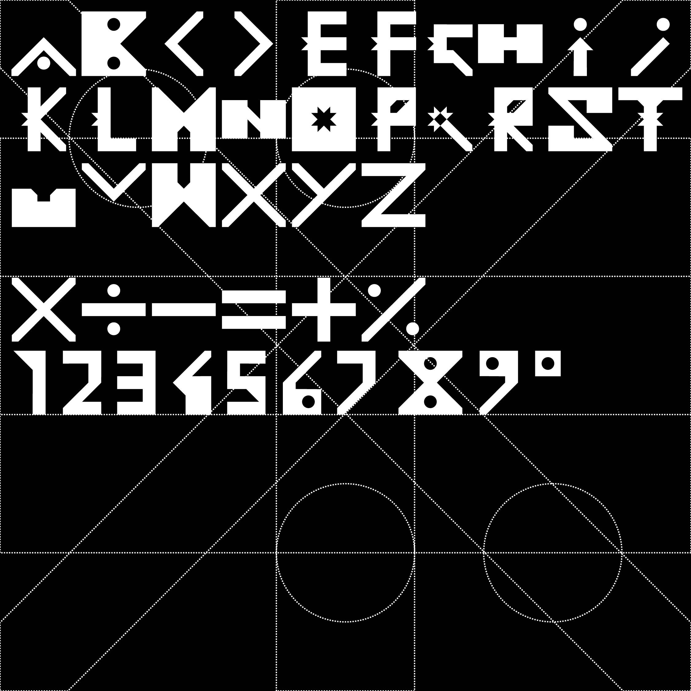
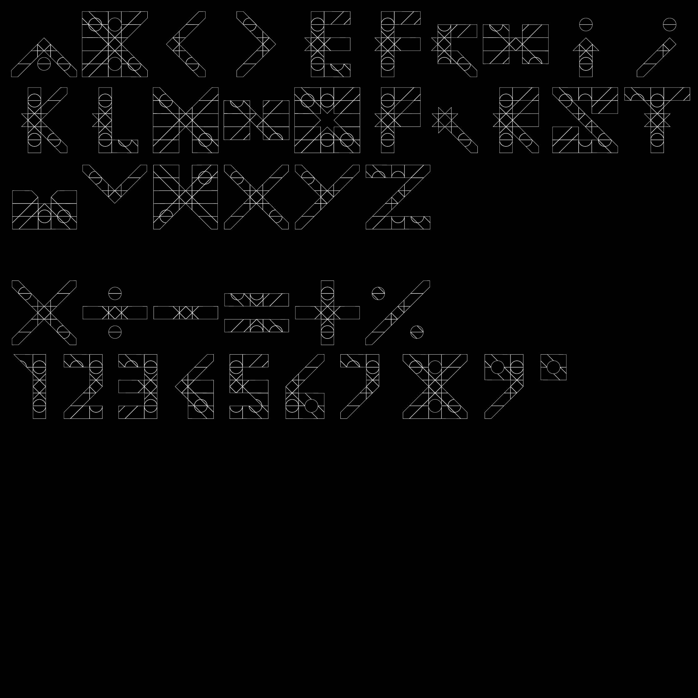
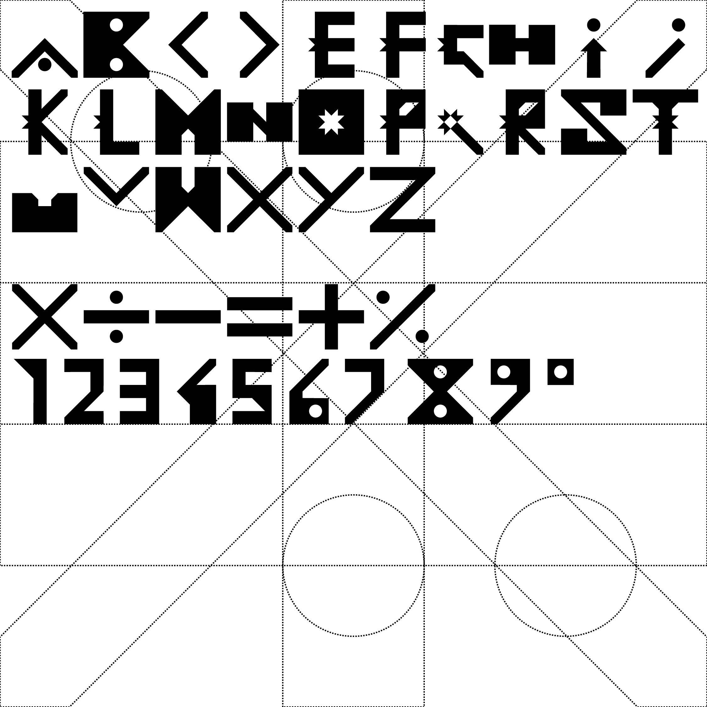
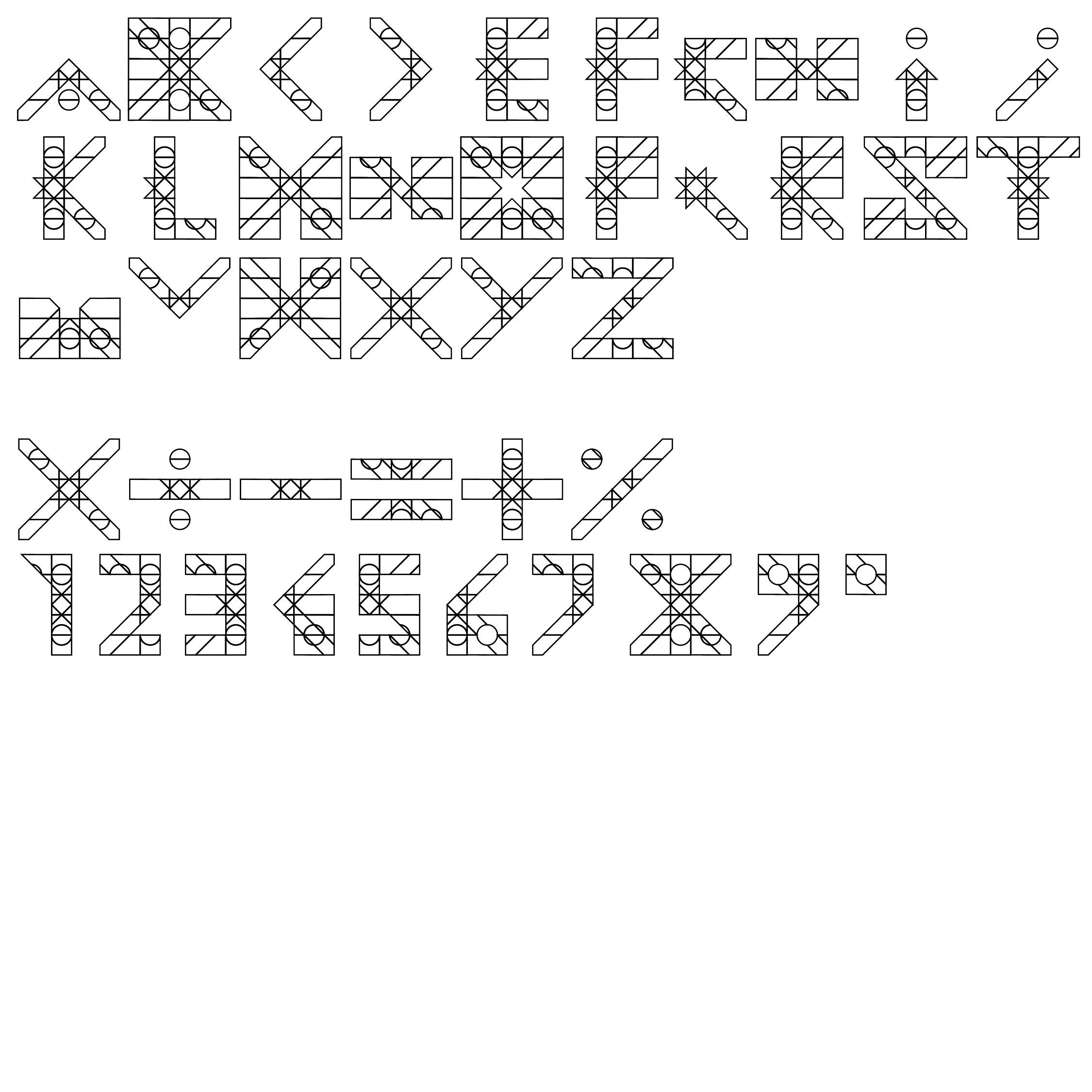


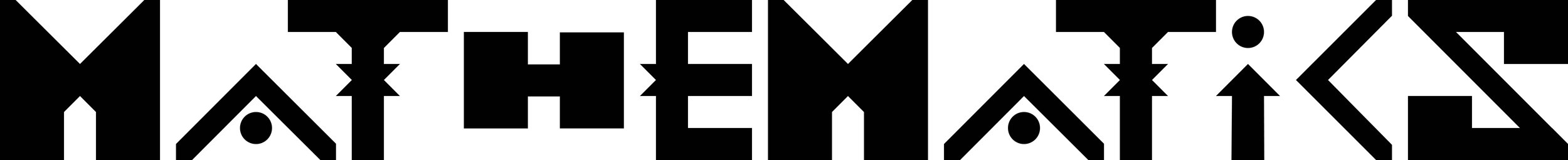
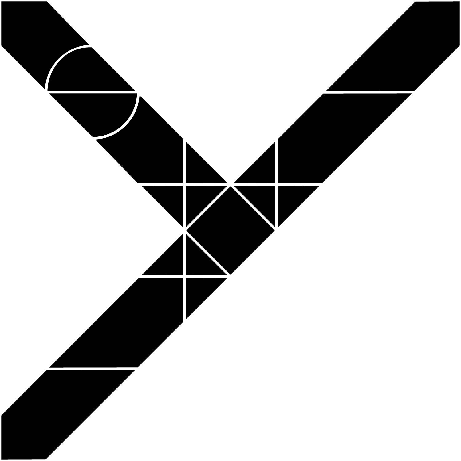
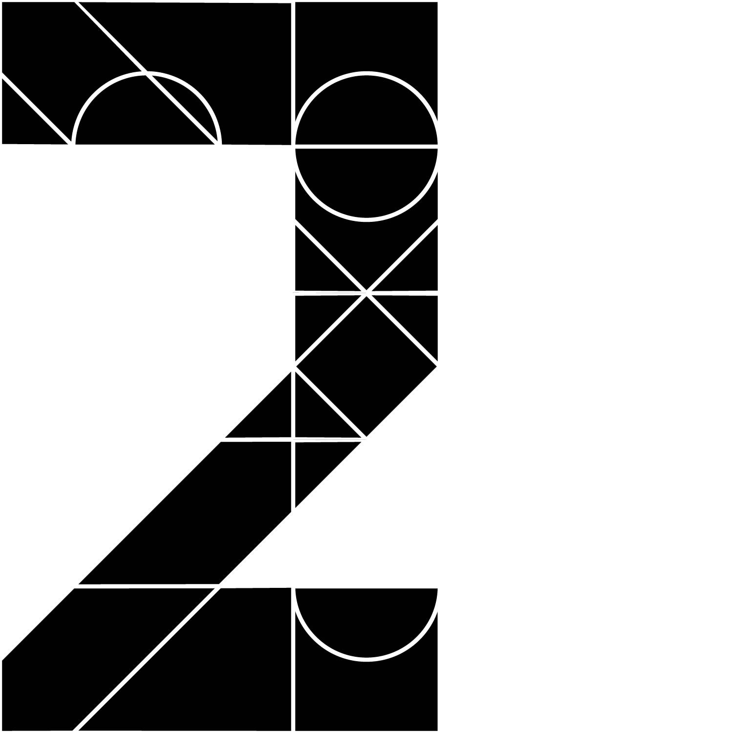
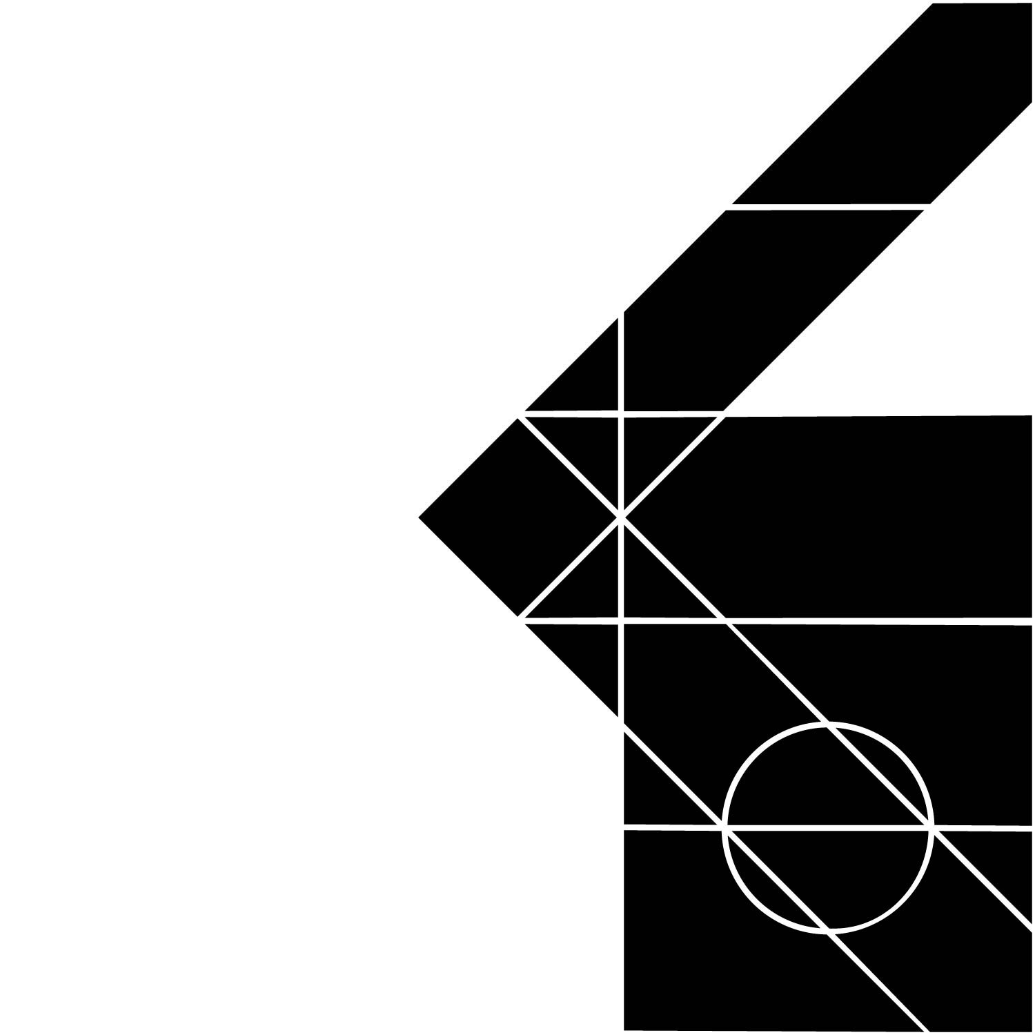
Above is a slider showing a few different variations of the final delivered typeface. I decided to call it ‘Mathematics’ due to the mathematical symbols used to create the modular grid. Some points to note:
The H differs a fair bit from the original drawing. Once I did the N, I went back to review the H and found it could be displayed more clearly with a more obviously defined crossbar.
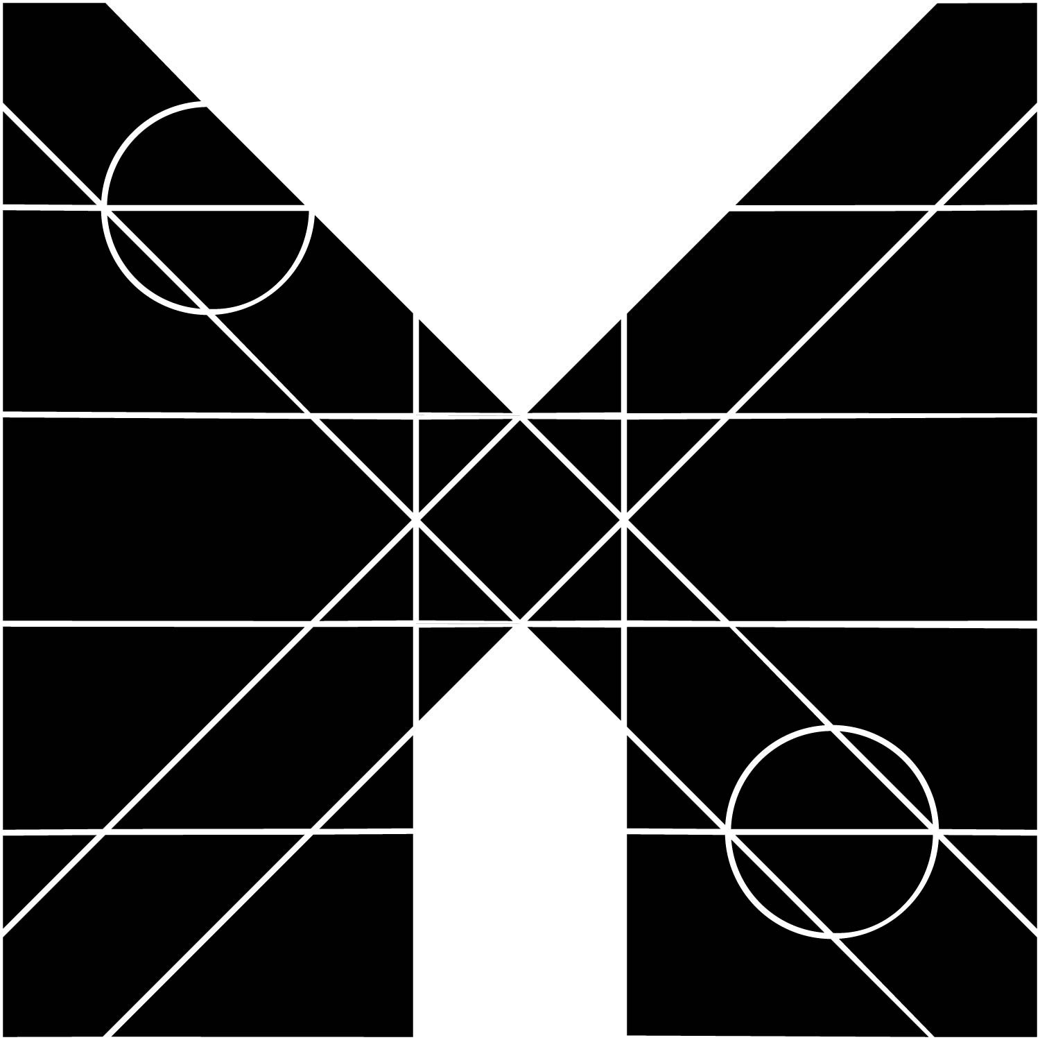
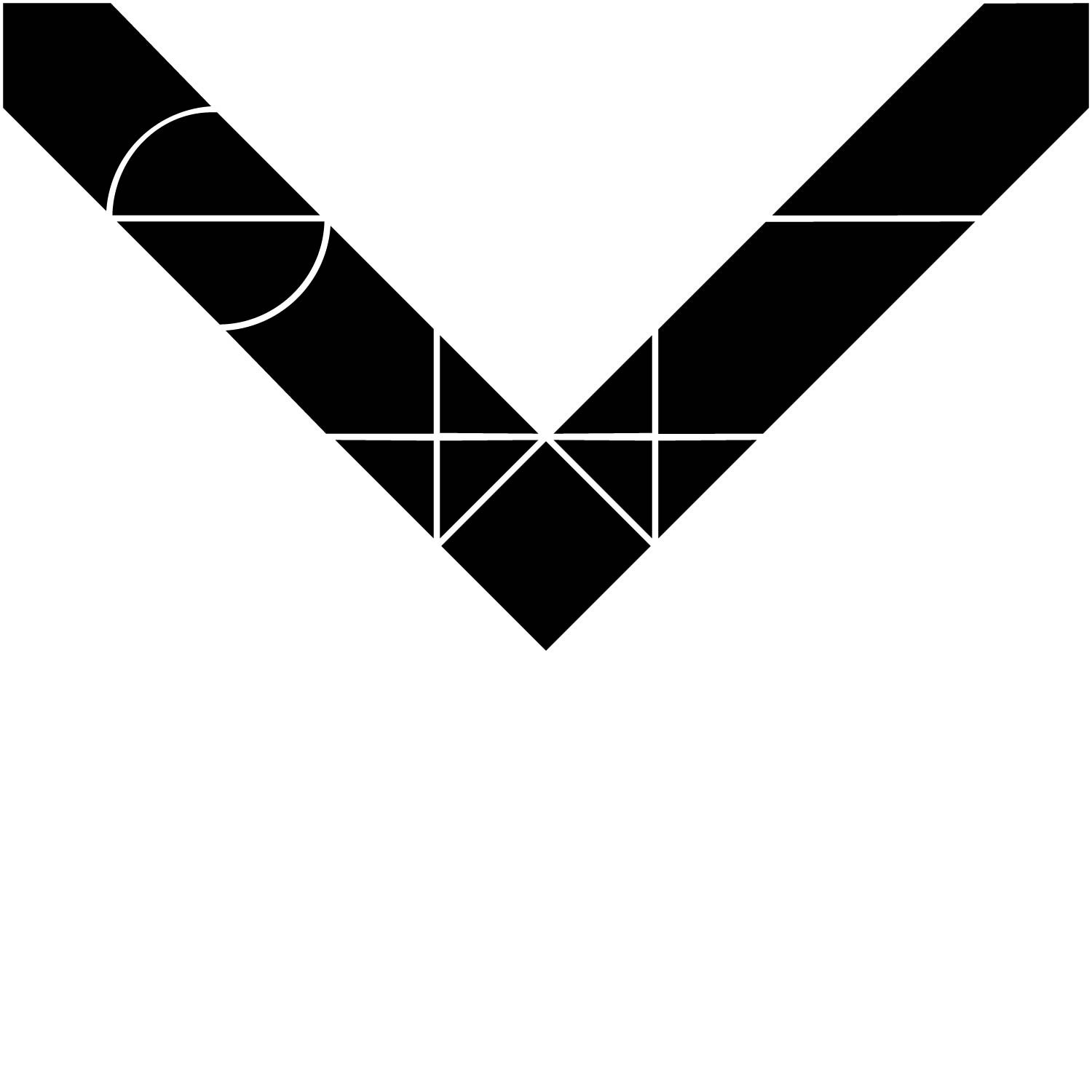
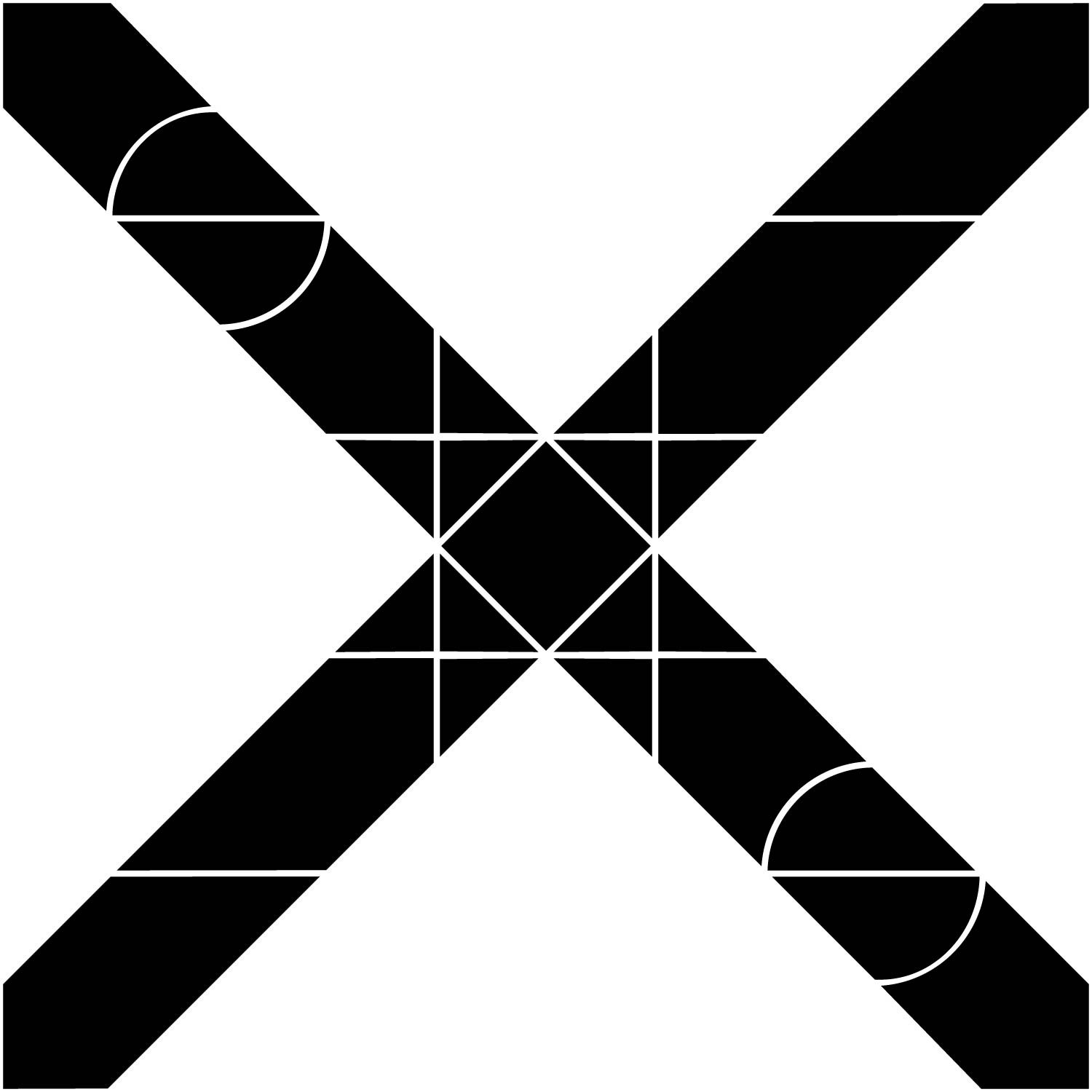
Where possible I tried to follow some of the rules / principles picked up from researching and exploring other typefaces. The M and W are similar. The S and 5 are distinct from each other, as are the U and V and the O and 0.
I tried to achieve some unity between the numerical digits, opting to only use part of the grid, but this was not possible for the 8. The 4 was quite tricky and isn’t the most legible.
Though not necessary, I kept some small embellishments (I think these would be called spurs?) on the E, F, G, K, L, P, R and T. I feel these look more interesting than they did without, and also they create some unity with the O, Q and I.
I tried to where possible to prioritise legibility over aesthetics: function over form. My inspiration for this typeface is the 7 segment display. I love the idea that this typeface that’s so universally recognisable - on calculators, fridges, watches - was actually the product of the limitations of technology, as opposed to being designed prior to the technology. My research article shows that patents for the 7 segment display date as early as 1903 (Posy, 2022). It doesn’t work because it’s the most elegant solution to a problem, it works because it’s the best and most efficient solution that can be done with the limitations of the technology - but importantly, it still works. The grid I’ve chosen is arguably less restrictive than the 7 segment display, and as shown below actually includes 55 segments.


Thanks for reading my blog.
References
Posy. (2022) Segmented Displays. Available at: https://www.youtube.com/watch?v=RTB5XhjbgZA&ab_channel=Posy (Accessed: 20/9/22).