#002 - Exploring Modular Typefaces
Originally uploaded September 20 2022.

Segmented displays on the cover of a video by Posy on YouTube
Today I’ll be exploring modular typefaces…
This blog will explore 4 examples modular typefaces - some modern and some classical/historical.
“A modular typeface is an alphabet constructed out of a limited number of shapes or modules. Modular describes any letter assembled from a limited palette of distinct elements, repeated, flipped and flopped but not scaled. Typically these elements are geometric and simple in shape—square pixels on a digital display or modernist circles, squares, and lines.”
Typeface #1 - Modern

Streco
by sophiatypelove (Instagram), 2022
Streco is a modular typeface I found on Instagram. The first thing I notice is that all of the characters are uppercase and all have the same X-height, apart from the ‘Q’ which has a descender dipping below the baseline. There’s also a notable consistency in terms of the shapes used: the core shapes are either half circles, squares or rectangles - or slight variations on these that have been cut or elongated. For the most part I think the design is quite effective. Some of the letterforms are not immediately legible. The ‘G’, ‘H’, ‘J’ on their own are hard to make out. The number forms are cleaner and more effective in terms of legibility.
Something notable is the lack of stems - there are no continuous lines running from the baseline to the capline. The distinction between the ‘U’ and ‘V’ is cleverly achieved by the rounded shoulder at the vertex of the ‘U’ with two squares on top - then the ‘V’ has a square at the vertex then the rounded base of the U is split and the two halves faced opposing one another to create a concave shape more suggestive of a traditional V. I expect that this typeface was created digitally using a grid with circular elements.
Typeface #2 - Classic

DSEG
by Keshikan けしかん, c. 1903
The 7 segment display is instantly recognisable and has become ubiquitous in our every day lives: from calculators to digital watches to fridges, microwaves and more. Patents for a 7 segment display can be found as early as 1903 (Posy, 2022). It is truly a representation of function over form. The letter forms have been created as a necessity of the limitations of technology. Using just 7 segments, all 26 characters and 10 digits can be displayed, with the addition of 7 more segments making the letterforms even clearer and allowing for uppercase characters.
Arguably the 7 segment display is most effective when representing digits. All digits can be display clearly without any compromise - apart from perhaps the 4 digit - though over time we have become accustomed to this representation where the two ascending stems are parallel, rather than the left being slanted toward the right, or closing to form a counter. The letter forms in the 7 segment display are less legible. Particularly ‘i’ ‘k’ ‘m’ ‘s’ ‘u’ ‘v’ ‘w’ and ‘z’ are difficult to decipher without being placed in context. Interestingly, the ‘s’ is compromised by losing its arm on the capline - perhaps so that it’s not confused with the ‘5’ which is very similar. The additional diagonal legs in the 14 segment display allows for the spine of the ‘s’ to be more clearly defined.
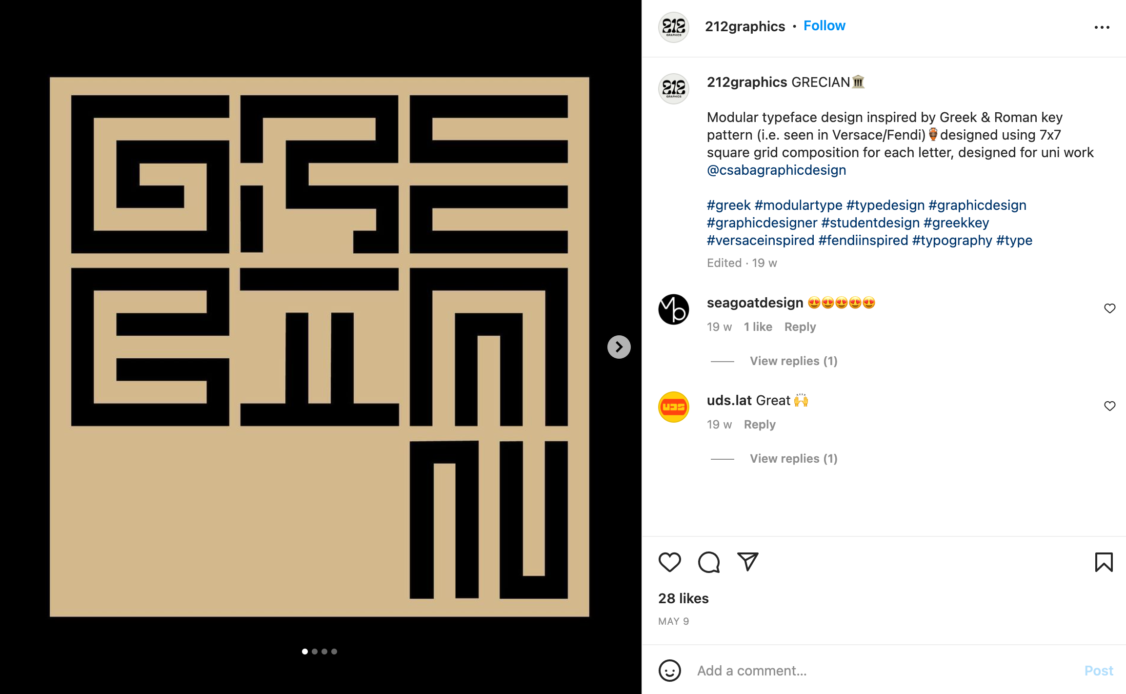
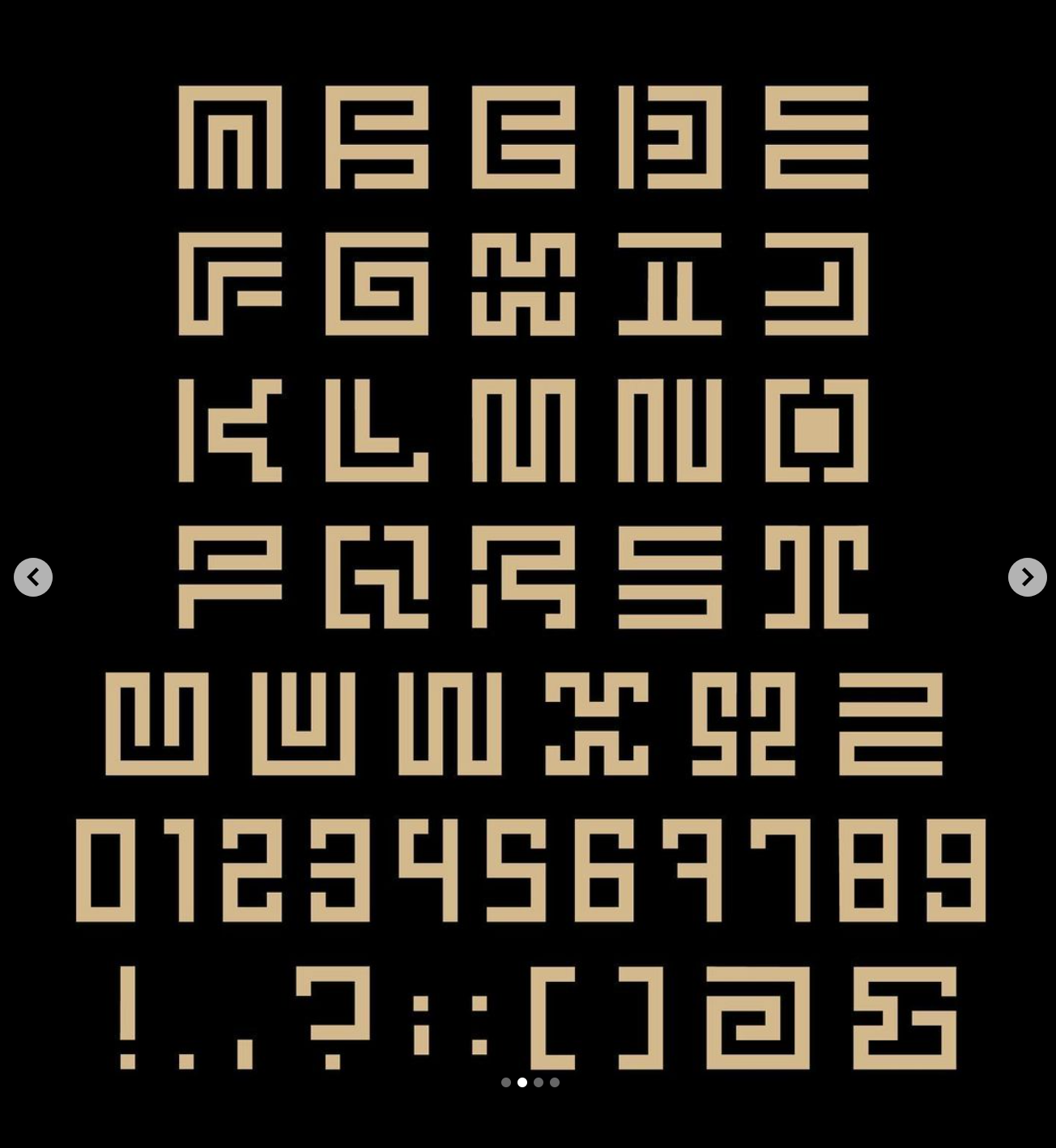
Typeface #3 - Modern

Grecian
by 212graphics (Instagram), 2022
Grecian is another typeface I discovered on Instagram. It cleverly takes inspiration from Greek architectural forms, such as Doric and Ionic pillars, but still only uses lines and squares and no rounded edges. In terms of how this typeface created, I believe the designer has used a 7x7 grid of squares for the characters and 7x4 grid for the digits. All characters are uppercase, and without the context of the full alphabet some of them are not immediately legible - particularly the ‘S’ and ‘Z’ - though I do admire the way these are mirrored versions of one another. The similarities between the ‘M’ ‘N’ ‘V’ and ‘W’ are notable. The ‘M’ mirrors the ‘W’, and although the ‘U is a mirror of the ‘A’, where it would traditionally mirror the ‘N’, the ‘N’ is cleverly conveyed with two opposing loops.
Typeface #4 - Classic

Patrona Grotesk
by V. Kánský, c. 1931
Patrona Grotesk was designed by V. Kánský, a Czech designer, for the type foundry of Prague ‘Slevarna Pisem’ circa 1931. His design reconfigures the alphabet using tiny printing component parts regulated by a grid. The stencil-like parts of the letterforms can be broken down into small sections, then rearranged into a variety of forms for a variety of different languages. (McNeil, 2017).
Due to the constrictions of the time period in which this typeface was created - i.e. pre-digital - Patrona Grotesk would have been made using a printing press - with each individual section of the letterforms being hand set using small pieces of metal (known as dingbats!) Due to the relative complexity of the component parts, it’s an extremely legible typeface.
Thanks for reading my blog.
References
Herstowski, A.(no date) Modular Font: Parts make the Whole, Available at: http://ku-viscom.com/type1/typography_p1_modularfont.html#:~:text=A%20modular%20typeface%20is%20an,and%20flopped%20but%20not%20scaled (Accessed: 20/9/22).
Posy. (2022) Segmented Displays. Available at: https://www.youtube.com/watch?v=RTB5XhjbgZA&ab_channel=Posy (Accessed: 20/9/22).
sophiatypelove. (2022) 'Last chance to buy Streco on @futurefonts before the update to version 0.2' [Instagram]. 2 September. Available at: https://www.instagram.com/p/Ch_1zXysbEp/ (Accessed: 20/9/22).
Keshikan けしかん. (2020) "DSEG": Original 7-segment and 14-segment fonts. Available at: https://www.keshikan.net/fonts-e.html (Accessed: 20/9/22).
Casciano, S. ‘212graphics’ (2022) 'GRECIAN' [Instagram]. 9 May. Available at: https://www.instagram.com/p/CdVzdCEImLg/ (Accessed: 20/9/22).
McNeil, P. (2017). The Visual History of Type author Paul McNeil selects and dissects his six favourite faces. Available at: https://www.itsnicethat.com/news/the-visual-history-of-type-paul-mcneil-graphic-design-publication-110917 (Accessed: 20/9/22)