#004 - Music Response: Album Research

‘The Most Iconic Album Covers of All-Time’ (AlfoMedia, 2019)
What makes a great album cover? Let’s explore.
Contents:
History of Album Artwork
Understanding Album Covers
Historical & Contemporary
Designers/Designs that Inspire You
History of Album Artwork
These days it’s hard to think about music in purely in terms of audio. The visuals of album artwork, videos, merchandise and brand have become intrinsically tied to our concept of music. But it wasn’t always that way, in fact prior to 1938 record packaging was purely utilitarian - cardboard sleeves to protect the records with basic text or record company logos - that was until Alexander Steinweiss became the very first art director of Columbia Records (Nerdwriter, 2015).

Nerdwriter, 2015
Steinweiss started producing original cover art to be printed on record sleeves, and almost overnight Columbia Records saw a massive boom in sales. As so often happens, the rest of the world caught on quickly and before long record stores across the USA then beyond were reconfigured not just for flipping through record spines, but to allow you to gaze adoringly at the fancy new album artwork. With the addition of artwork, music became a marketable product - a commodity for people to consume - and this was just the beginning (Nerdwriter, 2015).
Understanding Album Covers
Over the decades that followed Steinweiss, album covers have evolved, diversified and reinvented themselves countless times. However, there are some album covers that have stood the test of time, and others.. not so much. So what makes a great album cover? AlfoMedia (2019) splits into 3 key elements:
Thematic - Album covers that relay a message that’s in the music. An image that also has meaning that ties back to either the band, the album concept or ideally both. Examples include Nirvana, Nevermind or NWA, Straight Outta Compton.
Identity - Album covers with a sense of the musician’s personality projected onto the cover. You’re not just buying an album, you’re buying the artist and their constructed sense of self. Examples include Prince, Purple Rain, and Elvis Presley, self-titled.
Originality - Album covers that are abstract. They relay a relevant artistic expression. Ideally combining both a thematic message and an expression of the artist. These tend to be the rarest and also the most enduring of album covers. Examples include Pink Floyd, Dark Side of the Moon, The Beatles, Sgt. Pepper or Joy Division, Unknown Pleasures.

(AlfoMedia, 2019)
Historical & Contemporary
So we know what makes a great album cover. How has the changed over the years, if at all? Below are two case studies on album covers I personally think are great: Out of the Blue by Electric Light Orchestra (ELO) and Franz Ferdinand’s debut self-titled album.
Out of the Blue, ELO

Released in October 1977, Out of the Blue is the seventh studio album by ELO. It is among the group’s most commercially succesfful albums, selling over 10 million copies worldwide (Wikipedia, 2022).
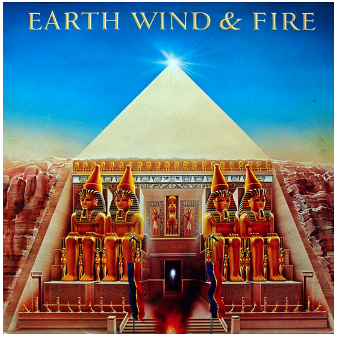
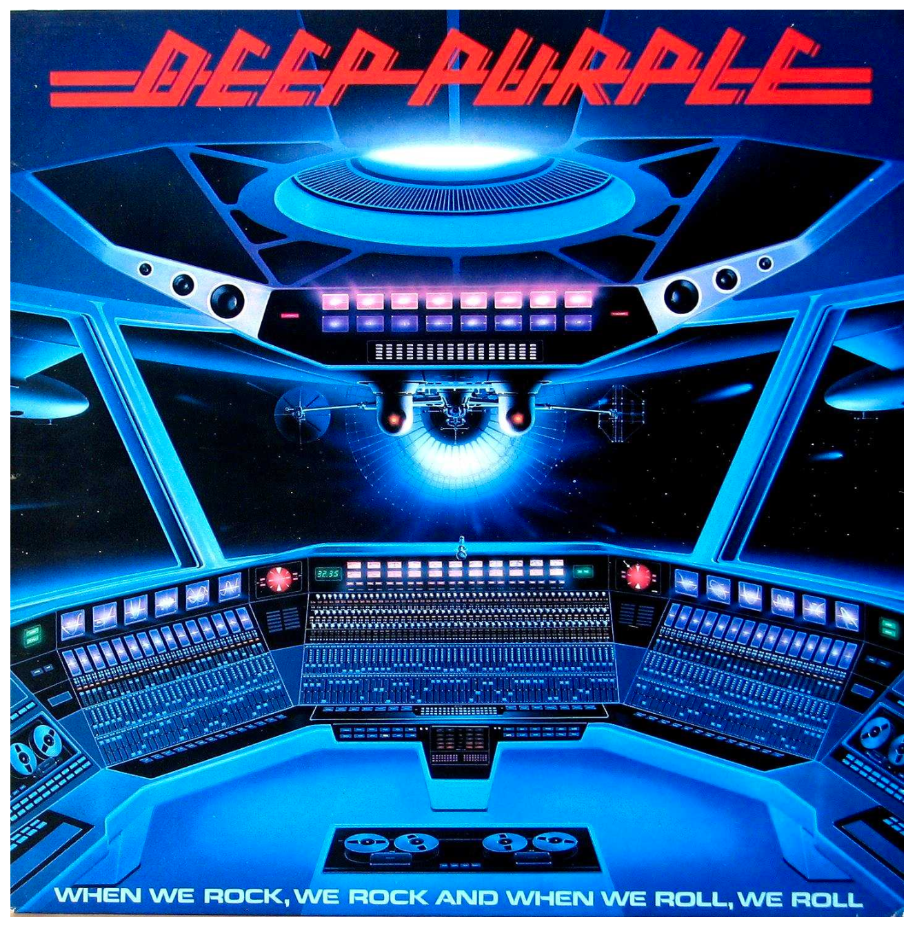
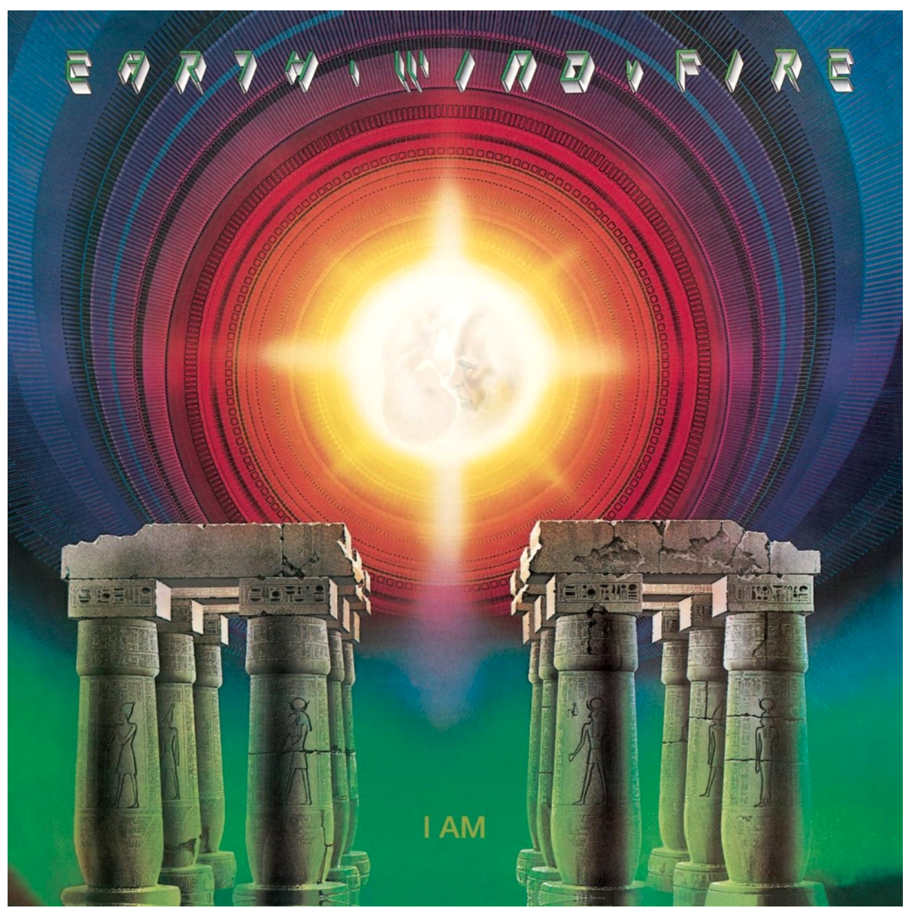
It begins with Shusei Nagoaka, a Japanese illustrator who is widely credited with having provided the illustration for this iconic album cover, amongst many others in the ‘70s and ‘80s. His incredibly detailed and vivid air brush style is instantly recognisable and can also be seen on the artwork of Earth, Wind and Fire, Deep Purple and other prominent bands of the time (Partin, N., 2015).
Nagaoka’s work held a strong visual kinship with neofuturist concept art visionaries like Ralph McQuarrie and Syd Mead, people who visualized massive-scope cities and vehicles of tomorrow. And with his immaculate, pinpoint-airbrushed detail, he could make even his more outlandish ideas look credible.
It’s fitting that Nagaoka’s artwork flourished in the late ’70s and early ’80s, when technological advances and disco-floor emphasis on altered-state audiovisual stimuli made new music feel like something out of the pages of Omni.
- Nate Partin (2015)
The somewhat bittersweet side of Nagoaka’s work is that after the ‘80s, he appears to have faded into obscurity (Partin, N., 2015). English designer Josh Kosh is credited with having designed the ELO logo which makes up a large portion of the cover (JeffLyneTribute, 2011) however, without Nagoaka’s iconic artwork to flesh out the space-age concept there’s no doubt in my mind that this album cover would still be remembered and revered today.
His work hits that sweet spot of combining abstract expression with a projected visual identity of the band and the message they want to convey - it screams ‘we are the band of the future’.
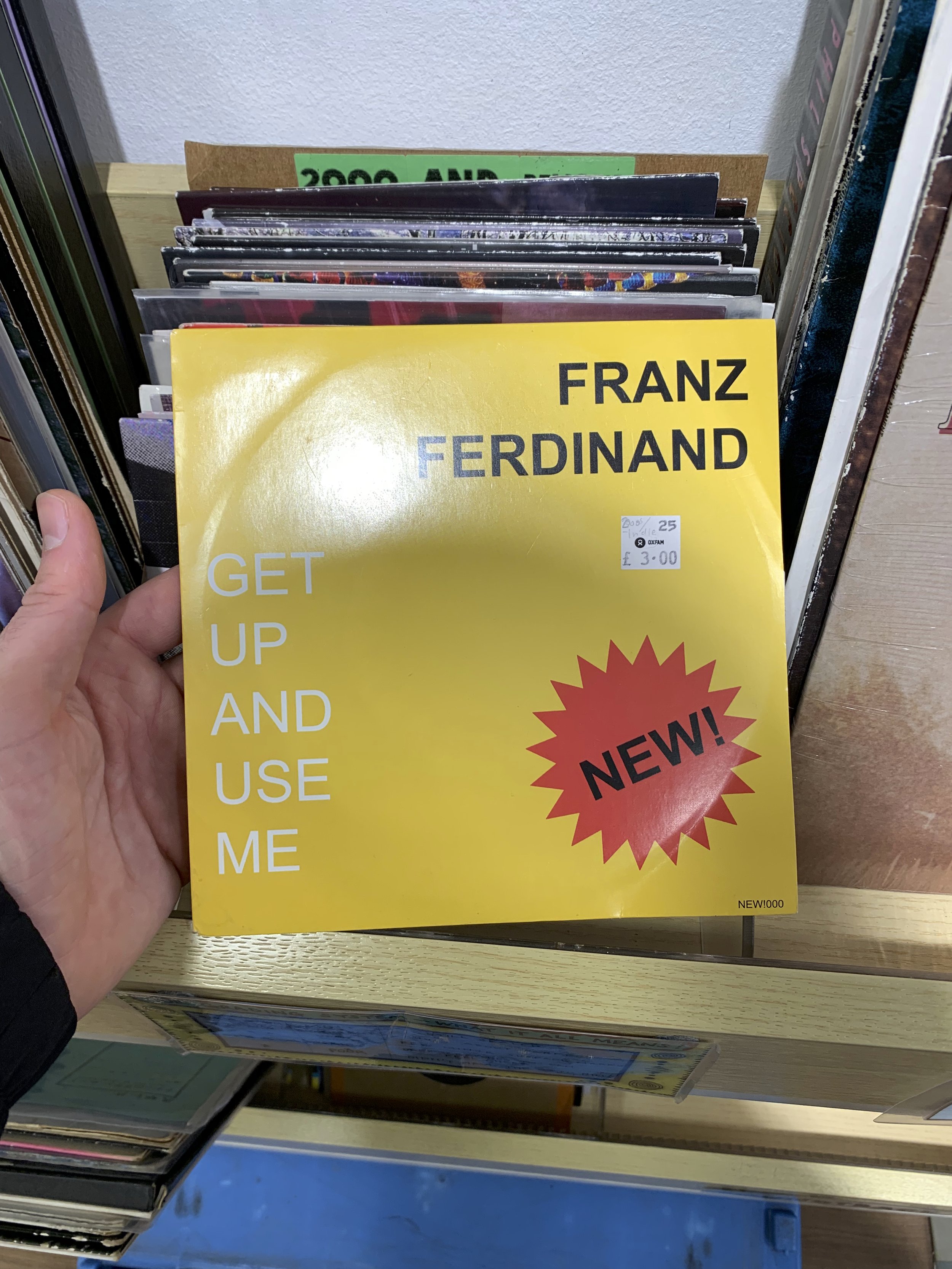
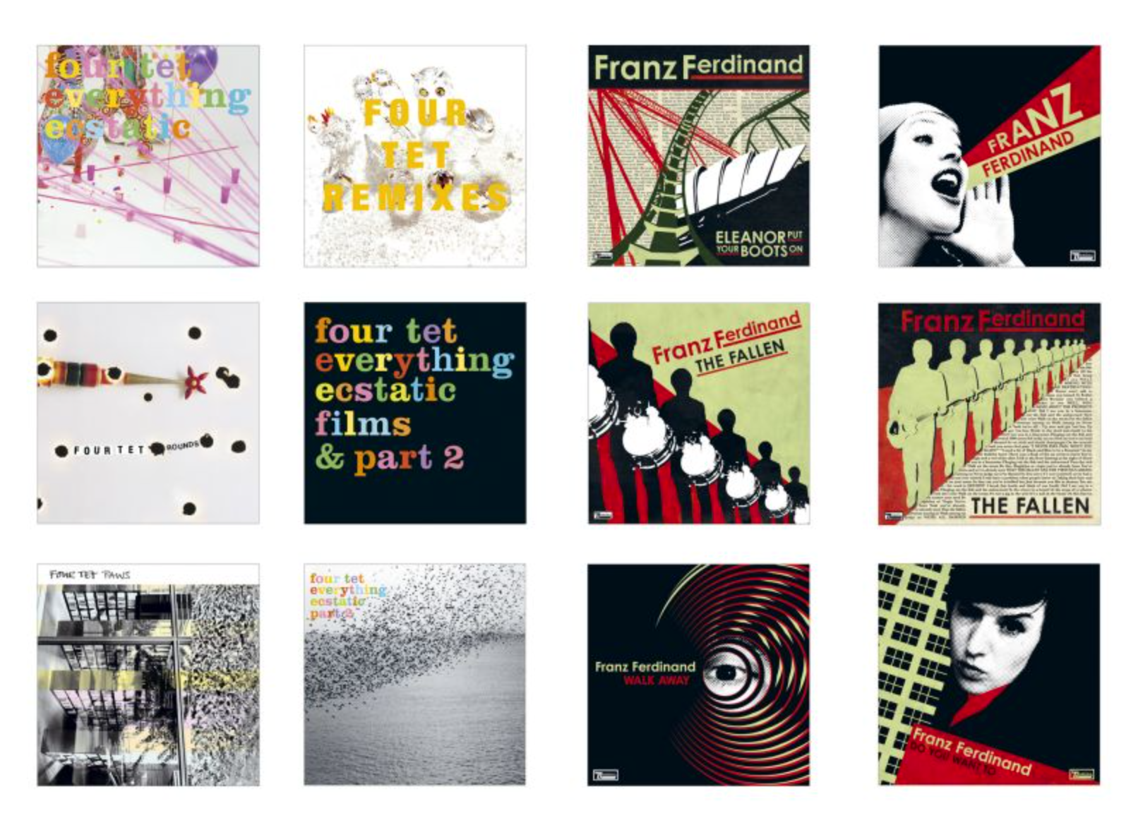
Franz Ferdinand

Jump forward to 2004 and we have the debut self-tiled release of Glaswegian indie rock band, Franz Ferdinand, which after release went on to sell 3.6m copies and win the Mercury Prize, all whilst solidly launching the band's career. This album cover is a different kettle of fish from ELO - it’s more paired back, straightforward, perhaps you could event go so far as to say simplistic - but the key thing is not its differences, it’s the similarities that make these both great album covers.
The designer, Matthew Cooper, has not only created an enduring album cover, through the use of a bold typeface that confidently announces the band’s presence, he’s created a logo and the basis of a brand that has developed with their career ever since.
Much the same as ELO’s futuristic jukebox spaceship, this logotype made using Century Gothic has become synonymous with the band. Not only is it aesthetically appealing and original but it has a message: ‘hello, here we are’. The band’s leader singer Alex Kaprianos reflects on the design with Cooper in this interview, writing:
AK: Same as the idea behind decent pop music: a few elements, bold and catchy.
MC: Its simplicity is its strength – fiddly logos can be a nightmare to work with. This one was nicely adaptable when needs be.
Jim K. Davies, 2020
Over the years the band and Cooper have cultivated a strong working relationship, going on to produce multiple successive albums that expand upon Franz Ferdinands’ visual vocabulary to such an extent that when you see a new album, you’re able to say ‘Ah, that’s them’. Cooper writes that the creative process was one that the band were very much involved in:
“The band would send me rough sketches or ideas which I would then develop further, tighten up or redo, depending on how fully formed their ideas were. The limited colour palette was settled on very early and became as much of a signature as the logo. Working within quite a well-defined design aesthetic – inspired very much by the Russian Constructivists, The Bauhaus and Dadaists – placed welcome restrictions on what we did. These were all references that were, happily, right up my street!”
Jim K. Davies, 2020
Designers/Designs that Inspire You
So we’ve looked at what makes a great album cover and an example of an historic and contemporary cover. Next we’ll explore some other designs and designers and that I find inspiring.

Unknown Pleasures
Joy Division, 1979
The cover of Joy Divisions’s Unknown Pleasures is about as iconic as they come. It’s almost guaranteed that if you ask anyone in the UK (well, born before 2000 maybe…) to name an iconic album cover then a solid proportion of them will say this one.
The thing that draws me to it is the same thing that makes it so successful: it’s the intrigue and mystery. What does that diagram mean? Is it a visual representation of the song? Why is there no name? Where can I get a t-shirt with this on it?
After a bit of digging you can find out that the basis of the design is fascinating. It’s not in fact an representation of the song’s sound waves at all, but rather a diagram depicting the deep space pulsar CP 1919, discovered November 1967 by student Jocelyn Bell Burnell and her supervisor Antony Hewish at Cambridge University (Radio X, 2020):
As the star turns, it emits electromagnetic radiation in a beam like a lighthouse, which can be picked up by radio telescopes. Each line on the image is an individual pulse. They’re not exactly the same each time as they’re travelling a long way across the universe and interference gets in the way.
Radio X, 2020
The story goes that band member Bernard Sumner, who himself was working as a designer at the time, came across the diagram in The Cambridge Encylopaedia of Astronomy which he’d visit on his lunch break to get a sandwich from the cafe. From there he handed the weighty tome over to now legendary designer Peter Saville and the rest, as they say, is history (Visualized, 2012).
There’s a geeky beauty in the meaning of the diagram that ties in so well with the band and their aesthetic and one again you have the perfect synchronicity of originality, theme and identity.

“Honey, what’s the matter? You’ve barely touched your Unknown Pleasures oven gloves!”
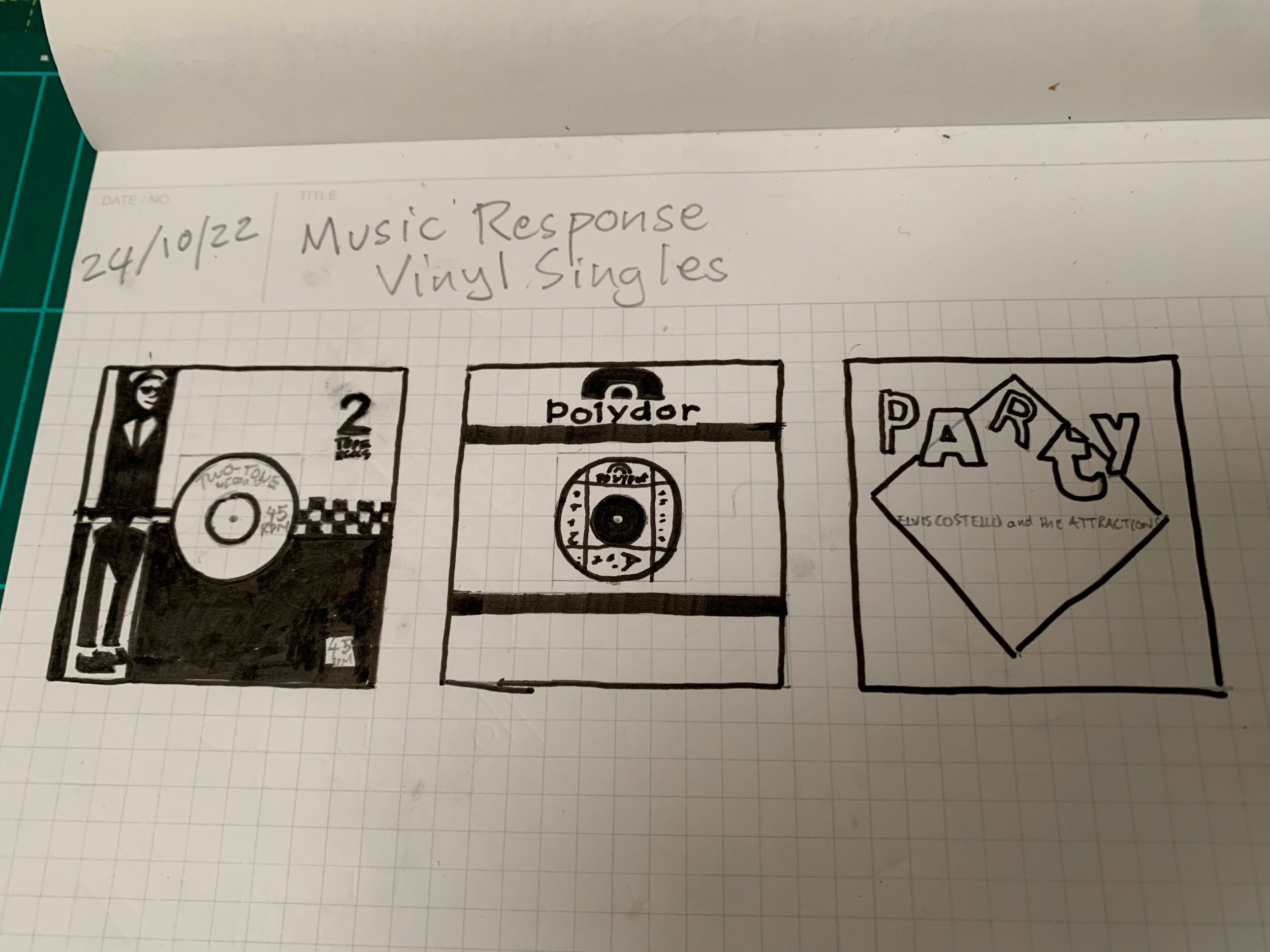
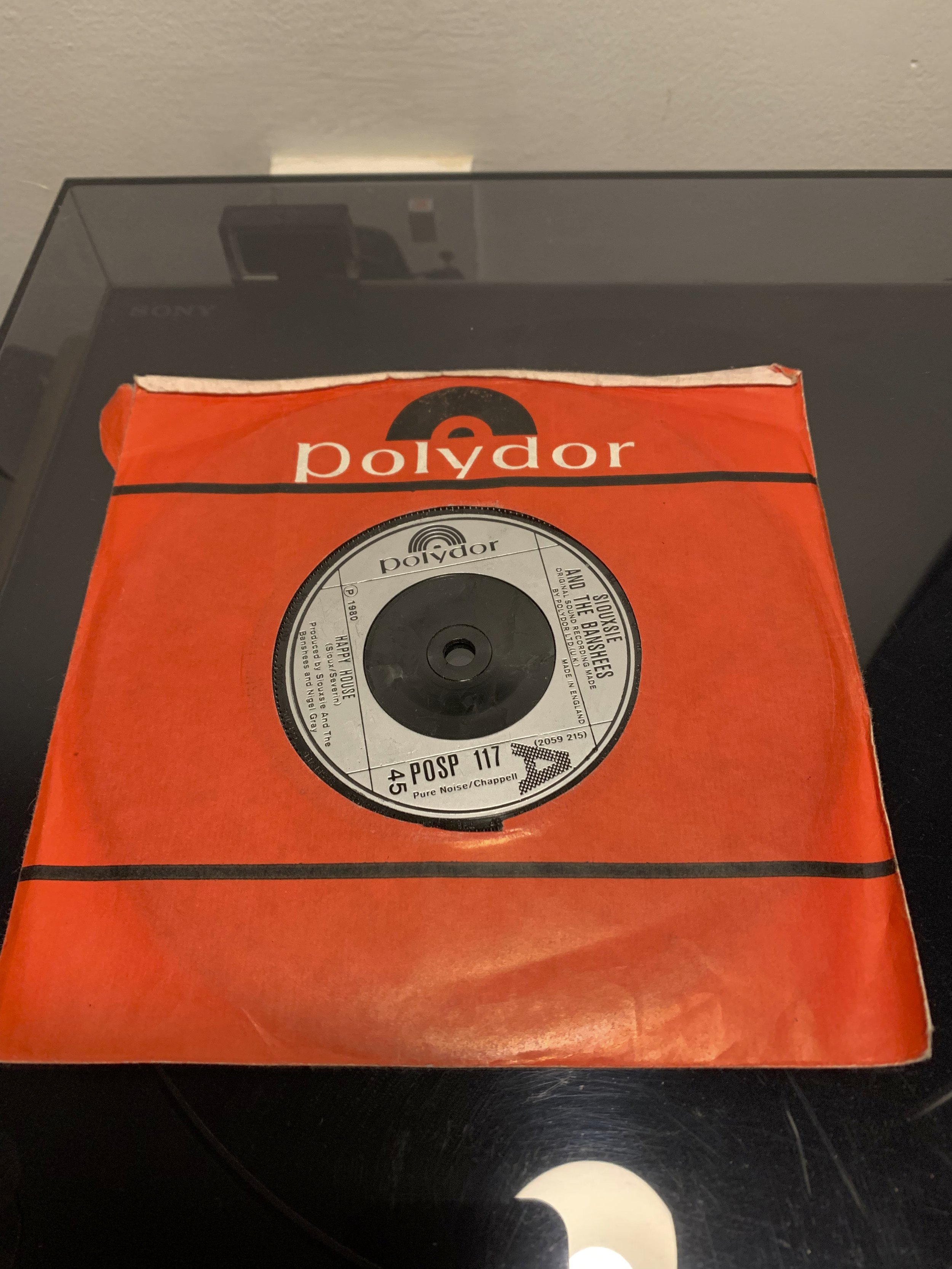
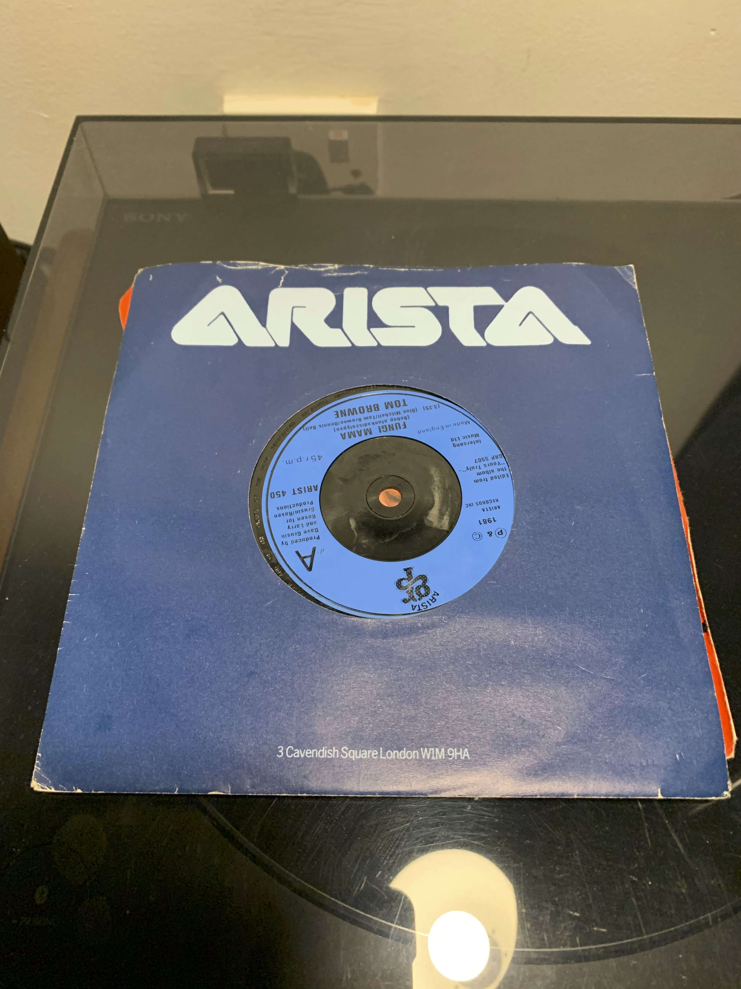
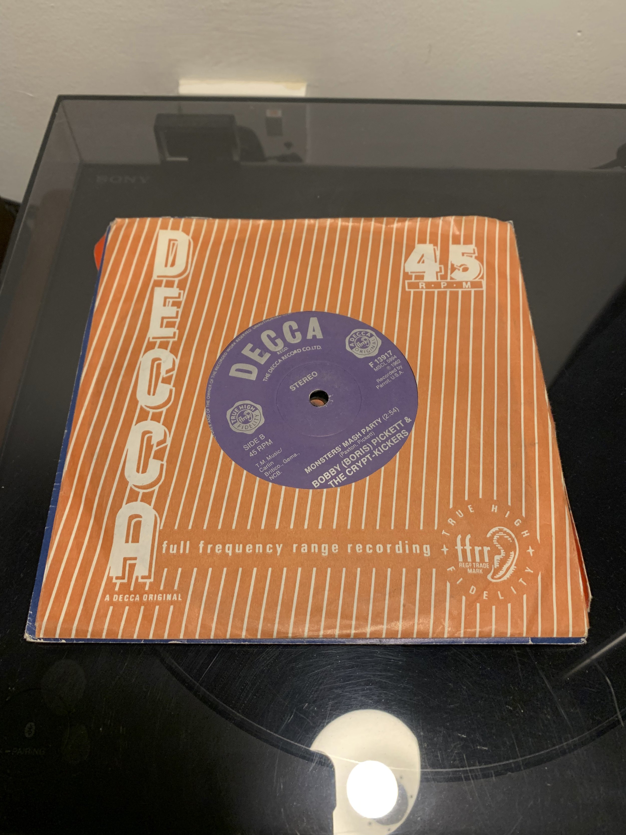
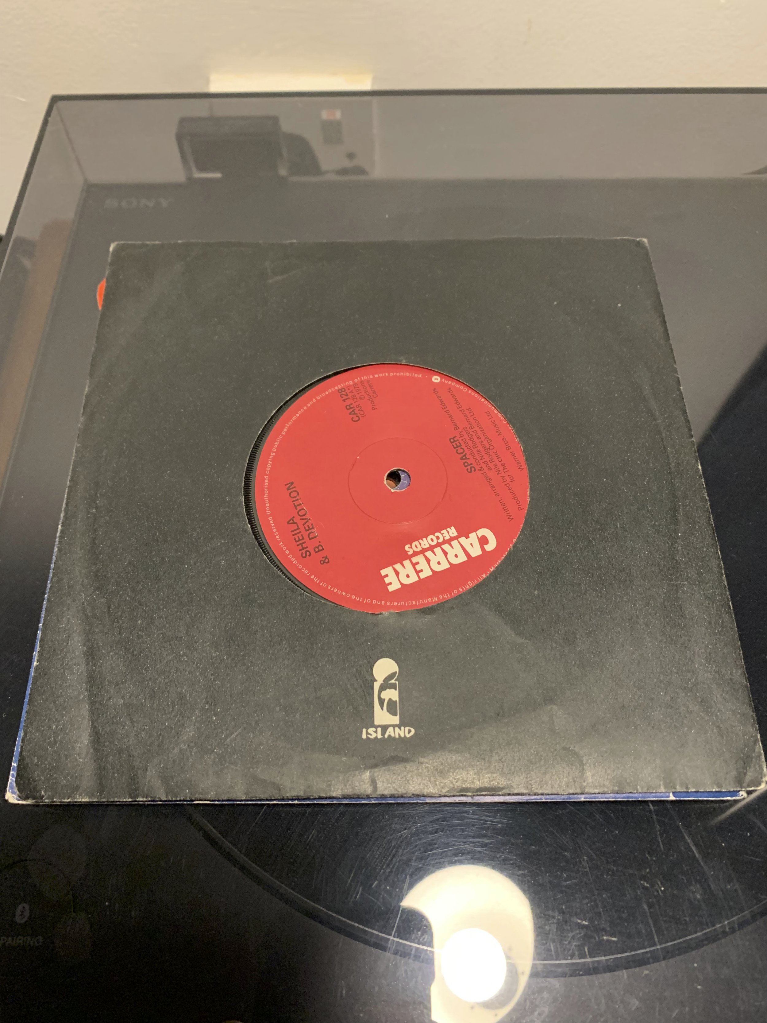
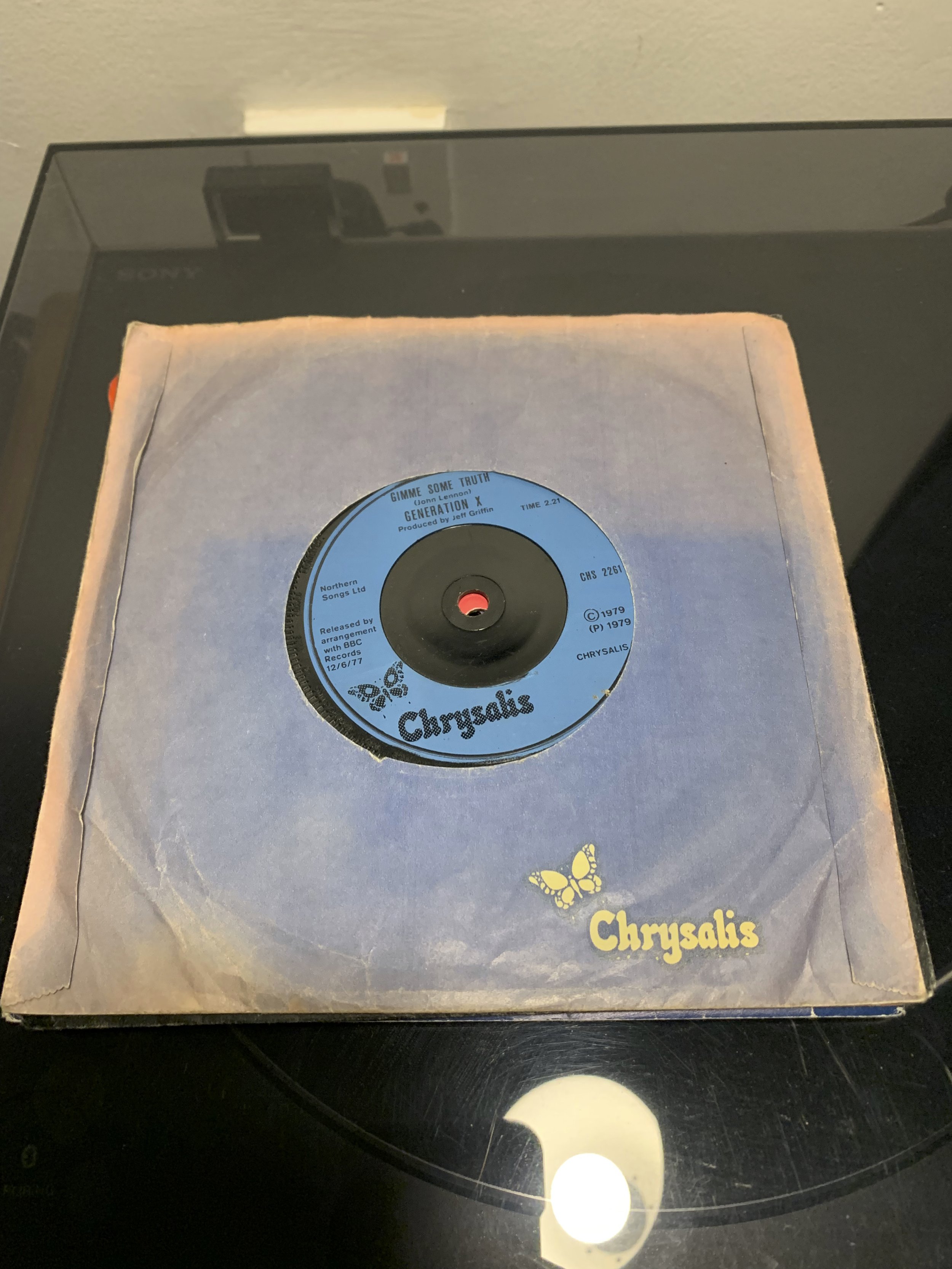
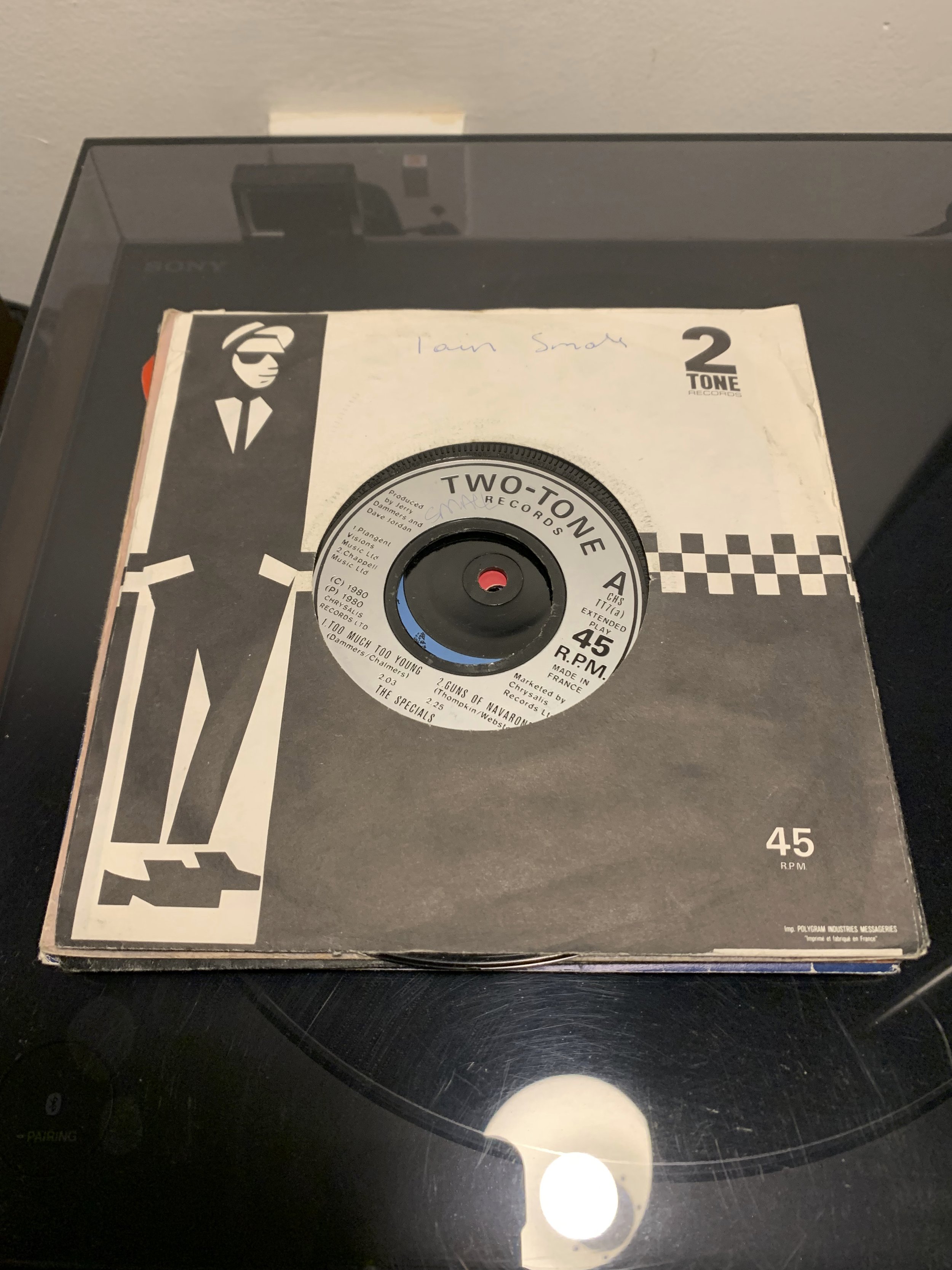
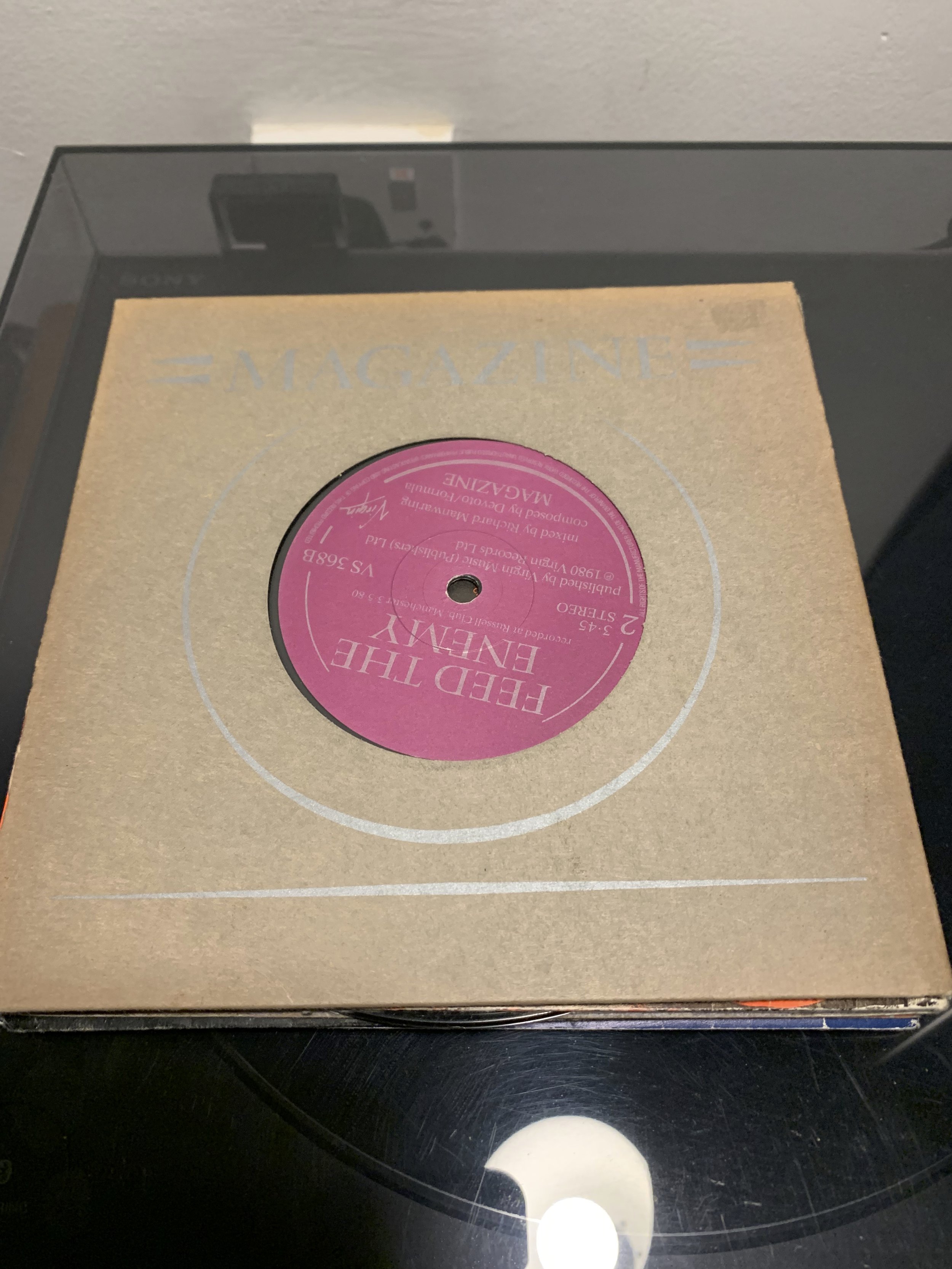
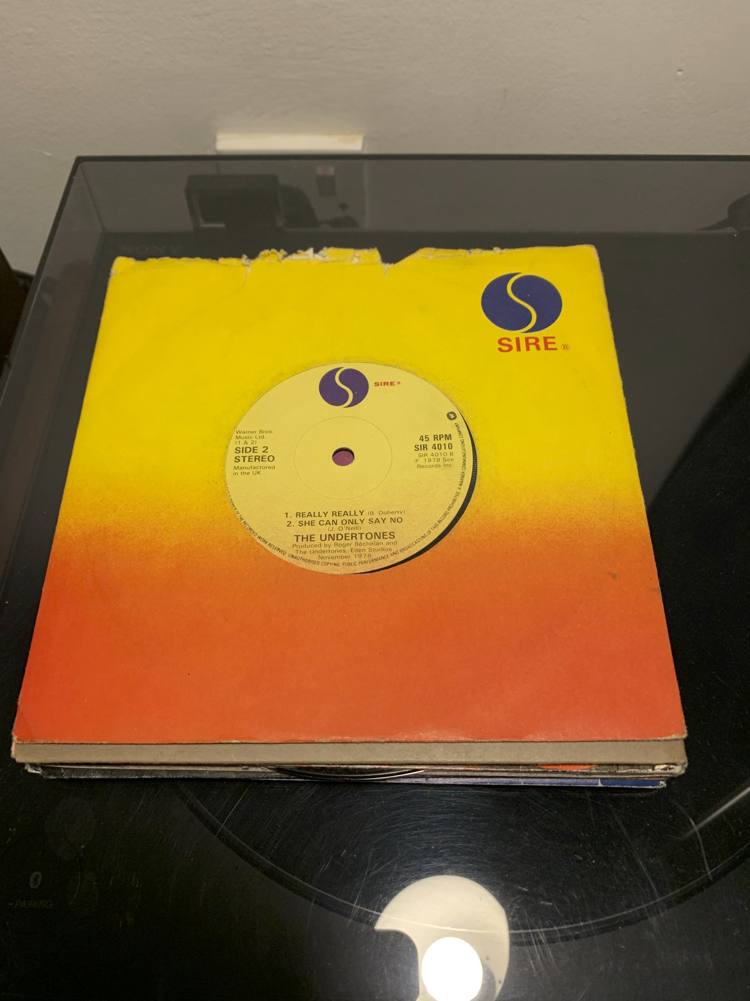
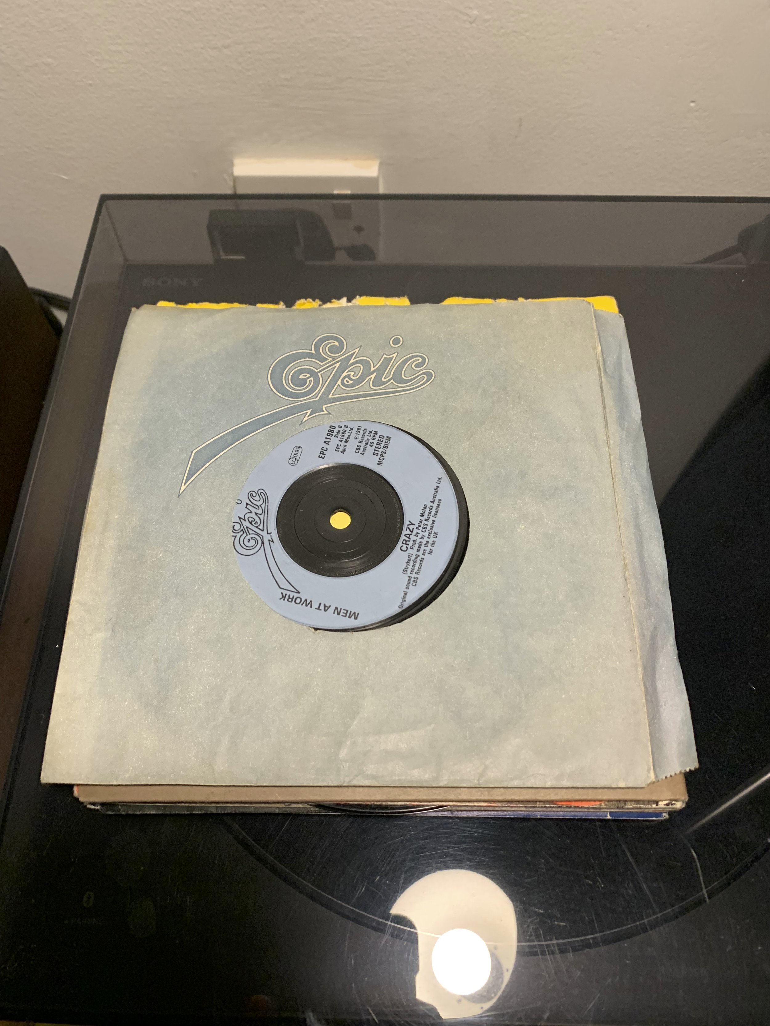
45 Singles
To round up this exploration of the album cover I’d like to take a minute to say how much I love the simplicity of old 45 inch singles. Whilst not technically album artwork, these paper sleeves that adorn singles have a certain charm. I really enjoy how the limited use of colour, type, line and shape combine to create a bold and identifiable cover, and though they of course lack theme, identity or originality, they’re often very pleasing to look at (and collect!)
Thanks for reading my blog.
References
Nerdwriter (2015) How The Beatles Changed Album Covers. Aug 12 2015. Available at: https://youtu.be/_st4diqjpis (Accessed: 25/10).
AlfoMedia (2019) The Most Iconic Album Covers of All-Time. Nov 27 2019. Available at: https://youtu.be/nbfwRkOVw7k (Accessed: 25/10).
Wikipedia (2022) Out of the Blue (Electric Light Orchestra album). Available at: https://en.wikipedia.org/wiki/Out_of_the_Blue_(Electric_Light_Orchestra_album) (Accessed: 25/10).
Patrin, N. (2015) A Tribute to Graphic Designer Shusei Nagaoka. Available at: https://daily.redbullmusicacademy.com/2015/08/shusei-nagaoka-feature (Accessed: 25/10).
JeffLyneTribute (2011) John Kosh talks about the Electric Light Orchestra logo. Oct 23 2011. Available at: https://youtu.be/QNLLQ5UBbME (Accessed: 25/10).
Davies, J.K. (2020) F2 — Franz Ferdinand. Available at: https://www.bandlogojukebox.com/blog/2020/5/20/f2-franz-ferdinand (Accessed: 25/10).
Radio X (2020) What does the cover of Joy Division's Unknown Pleasures mean? Available at: https://www.radiox.co.uk/artists/joy-division/cover-joy-division-unknown-pleasures-meaning/ (Accessed: 25/10).
Visualized (2012) Data Visualization Reinterpreted: The Story of Joy Division's "Unknown Pleasures" Album Design. Oct 17 2012. Available at: https://youtu.be/reEQye0EOAw (Accessed: 25/10).